Saturday, May 4, 2013
Auto-generated 3D Models - PART 2
Spot the difference!
 "Sharpen your eyes!" is the title of a fun pastime for young and old that is published weekly by the more common Italian magazine of Enigmistica "La Settimana Enigmistica".
In this case we have to find 20 different small details in two almost identical cartoons showing two people who compete for one model... oops... umbrella! ;)
A little game that I do with pleasure from time to time, and that today I'll just play with you on a different type of cartoons, as you will have the patience to read, in the following, the second part of "Auto-generated 3D Models".
AUTO-GENERATED 3D MODELS
PART 2
A VISUAL COMPARATION
© Enrico Dalbosco (Arrigo Silva) April-May 2013
Last update: May 4, 2013
Index of contents
PART 1 - ENVIRONMENT <== Click Here To Read PART 1!
1. Introduction
2. The most common Scenarios representing the Earth
3. My early observations on the Scenarios
1. Introduction
2. The most common Scenarios representing the Earth
3. My early observations on the Scenarios
PART 2 - A VISUAL CONFRONTATION <== Current Post
4. Man VS Machine: A Visual Comparison between Scenarios X,Y
5. The Visual Characteristics of the Scenarios X,Y
5.1 The Visual Impression Summary Table
5.2 Comparing the Scenarios X,Y according to the Visual Impressions
4. Man VS Machine: A Visual Comparison between Scenarios X,Y
5. The Visual Characteristics of the Scenarios X,Y
5.1 The Visual Impression Summary Table
5.2 Comparing the Scenarios X,Y according to the Visual Impressions
PART 3 - WHAT FUTURE... ? <== work in process
More about 3D representation / Factors which influence the evaluation of the Scenarios / Pros and Cons for the USERS and SUPPLIERS / What future for the current 3D Warehouse modelers? / Conclusions
More about 3D representation / Factors which influence the evaluation of the Scenarios / Pros and Cons for the USERS and SUPPLIERS / What future for the current 3D Warehouse modelers? / Conclusions

4. Man VS Machine: A visual comparison between Scenarios X,Y (April 2013)
The pictures of the Scenarios that will be shown and compared in this section refer to the city of Rome, and specifically to the St. Peter's Basilica and its surroundings located partially in the State of the Vatican and partially in Italy.
The comparison will be made between pictures taken from the Scenarios X and Y, previously described in Part1>Section 2.
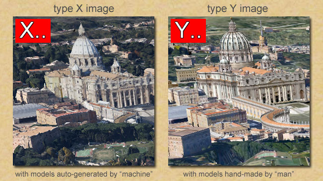
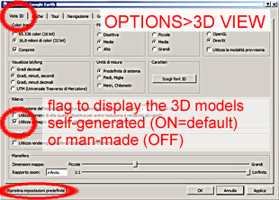 The pictures taken from the Scenario X will be named "X pictures" and are obtained from Google Earth enabling the visualisation of the auto-generated 3D Models.
The pictures taken from the Scenario Y will be named "Y pictures" and are obtained from Google Earth enabling the visualisation of the man-made 3D Models.
I got both types of images on my personal computer using Google Earth Version 7.0.2 for Windows Vista; for the "X pictures" I've set the option flag to ON (see the picture on the right) [unfortunately this is the default option for my Version of GE...], while for the "Y pictures" I've set the option flag to OFF.

The diagram below shows all the images that will be displayed later in this section (all the pictures have the same format of 660x474 pixels).
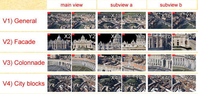
There are a total of 24 pictures that relate to 12 views - for each view will be shown a pair of images, organized and named according to the following criteria:
- I have chosen four main views: V1) General, V2) Facade, V3) Colonnade, V4) City blocks
- For each main View I identified two subviews "interesting", eg for V1) General I identified two views, V1a) with the Basilica and the Square and V1b) with the river Tiber
- For each view I have provided the two versions: "machine" with the prefix X and "man" with the prefix Y - so for the view V1) we have the two images X1 and Y1 , for the view V1a) we have X1a and Y1a , etc.

In the remainder of this section, I present the 12 pairs of pictures, providing for each a few notes, and referring the reader to the next section for a first summary of the various considerations that emerged from this analysis.
Warning 1
The pictures are been chosen to include: structured artifacts as artistic buildings, historical buildings, residential buildings; civil works such as roads, bridges, embankments, walls, sports fileds and natural features such as rivers, meadows, trees etc.
I think that the pictures choosen would cover almost all of the typical situations.
Warning 2
The comments on the pictures are made trying to watch them through the eyes of an ordinary person ("the man in the street"), without considering possible specializations as "the business man", "the tourist", "the art lover", "the urban planner", etc. and even less "the 3D modeler!"
Even with this simplification, I think that the comments can be equally significant.
Warning 3
It is important to emphasize that the image size has a great influence in the proceedings and in comparison of pairs of images, especially as regards the appreciation and evaluation of the degree of detail.
So if you're reading this article on a different device (phone, tablet, etc..) your feelings and considerations could 'legitimately' be discordant from mine...
The pictures are been chosen to include: structured artifacts as artistic buildings, historical buildings, residential buildings; civil works such as roads, bridges, embankments, walls, sports fileds and natural features such as rivers, meadows, trees etc.
I think that the pictures choosen would cover almost all of the typical situations.
Warning 2
The comments on the pictures are made trying to watch them through the eyes of an ordinary person ("the man in the street"), without considering possible specializations as "the business man", "the tourist", "the art lover", "the urban planner", etc. and even less "the 3D modeler!"
Even with this simplification, I think that the comments can be equally significant.
Warning 3
It is important to emphasize that the image size has a great influence in the proceedings and in comparison of pairs of images, especially as regards the appreciation and evaluation of the degree of detail.
To be more precise we can say that the main elements that contribute to the determine the degree of sharpness of vision are: the size in pixels of the image, the zoom factor used in the visualization, the size of the pixels on the screen, its brightness etc. etc. and finally the distance from which the screen is watched).
My evaluations were made just on the pictures presented below of 660x474 pixels using the screen of my Personal Computer on which each picture has a size of about 16,5x12,0 cm - and seeing the pictures from about 50 cm.So if you're reading this article on a different device (phone, tablet, etc..) your feelings and considerations could 'legitimately' be discordant from mine...
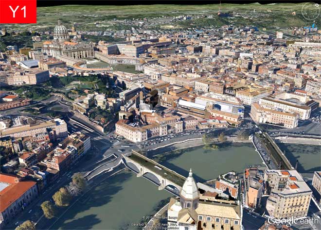
V1) GENERAL
This first view is a "long shot" of St. Peter's with a close up on the bend of the Tiber River.
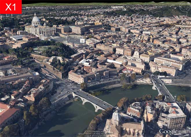
The picture X appears even and well-balanced in colors and looks very realistic, even if we can a few imperfections in the church at the bottom and the "strange" form of the St. Peter's big dome. The effect of "realism" is reinforced by details such as the presence of numerous trees and the consistency of the shadows.
In the picture Y our attention is immediately drawn to the deformations of the river banks. At the same time it must be noted, however, that the buildings appear geometrically well-defined and properly colored. We notice also the absense of 3D vegetation.
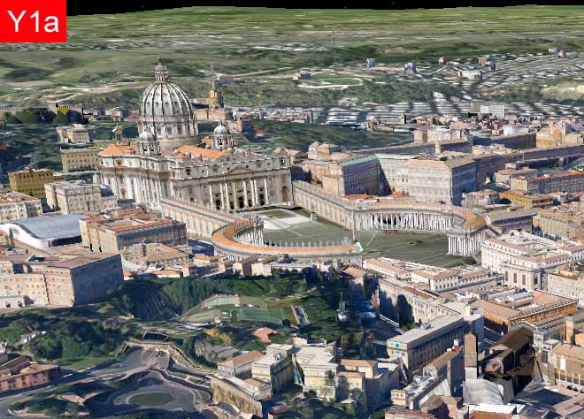
V1a) GENERAL - Saint Peter
This subview focuses on the St. Peter (the Basilica, the Square, the Bernini's Colonnade) and on the immediate surroundings.
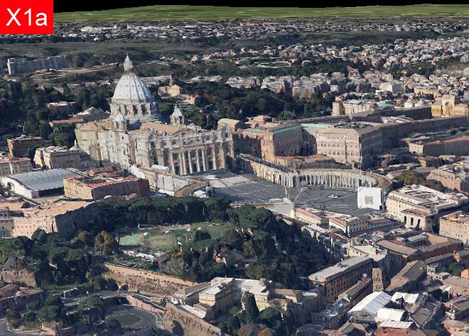
The picture X appear very natural (with the exception of the "strange" form of the St. Peter's big dome). The effect of "realism" is reinforced by the presence of "work in progress" on Bernini's Colonnade and of the wide and varied green area on the left.
The picture Y appears well defined in the architectures and textures of the Basilica, the Colonnade and buildings, even if we notice the lack of shadows and the alarming terrain deformations especially in the green area to the left.
V1b) GENERAL - The river Tiber
This subview focuses on the bend of Tiber River and its surroundings.
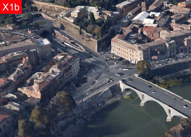
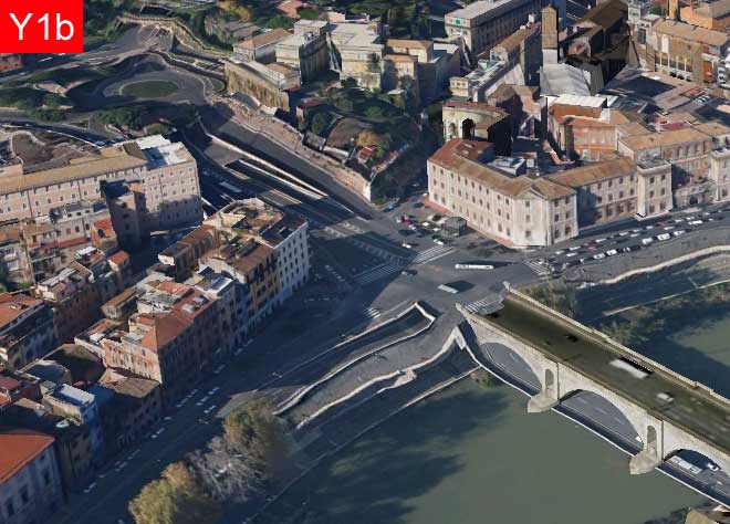
In the picture X the layout of the road works, the banks of the river and the bridge looks realistic, while the buildings on the bottom left look deformed.
In the picture Y the buildings look detailed, while the layout of the road works etc. looks deformed.
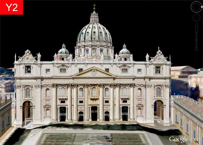
V2) ST. PETER'S FACADE
This view is a close-up of the facade of St. Peter's Basilica behind which you can see the big dome and two smaller domes.
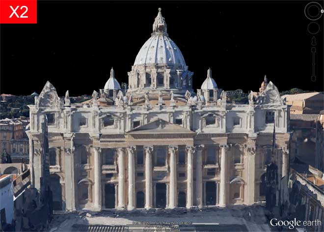
In the picture X the facade of the Basilica and the Domes appear roughly sketched and a little irregular; in return, the general tone of light and colors appears pleasant and realistic. The hazy structures on the left and on the right make us realize that there are some works in progress.
In the picture Y the definition and precision of the geometry and the sharpness of the images allow us to follow the architectural details of the facade and the domes.
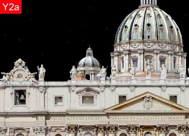
V2a) FACADE - The top of the facade and the domes
This subview focuses on the left top of the facade and the domes.
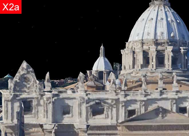
In the picture X the definition and precision of geometry and textures don't allow to read the architectural structures and rhythms and don't allow to decipher the details of the order of fraction of a meter, thus making the various statues above the facade not decipherable.
In the picture Y the definition and precision of the geometry and the sharpness of the textures allow us to follow the architectural details of the facade and the domes.
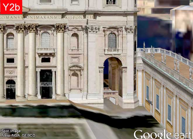
V2b) FACADE - The corner at the bottom right
This subview focuses on the right bottom of the facade.
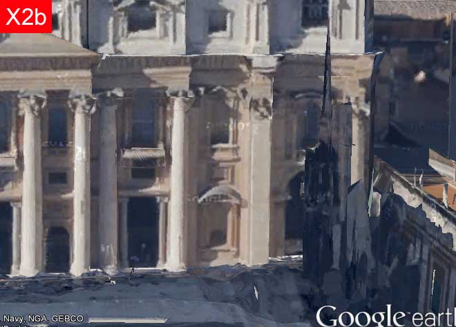
In the picture X the definition and precision of geometry and textures don't allow to read the architectural structures and rhythms particularly at the junction of the facade with the building on the right: the situation is indecipherable due to the presence of works in progress.
In the picture Y the definition and precision of the geometry and the sharpness of the textures allow us to follow the architectural details of the facade and the domes. It should be noted, however, that the shadows on the ground are incongruent with the lack of shadows on the facade and on the building on the right.
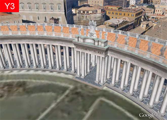
V3) BERNINI'S COLONNADE
This view is a close-up of the northern central gate of Bernini's Colonnade behind which we can see various buildings of Vatican City and Rome.
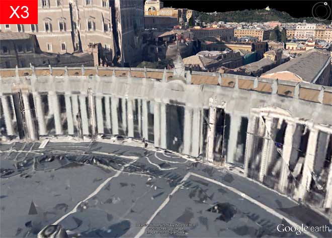
In the picture X appear several inaccuracies and inconsistencies in the visual field of the terrain of the Square, in the structure of the columns and in the building on the left.
The picture Y appears very well defined with regard to the architecture but less defined with regard to the balustrade and the statues and too blurred regarding the terrain of the Square.
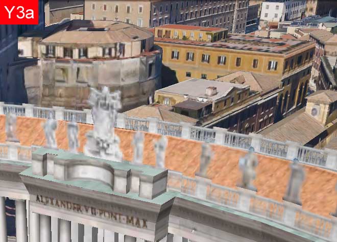
V3a) COLONNADE - The roof and the buildings behind
This subview focuses on the top of the northern gate of the Colonnade including the buildings behind.
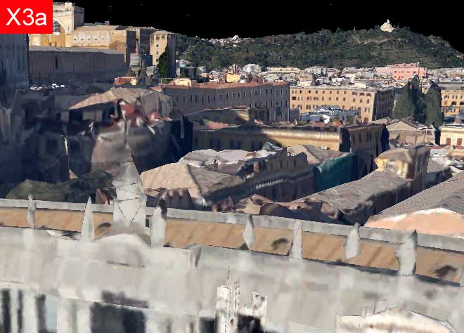
In the picture X the foreground looks very confused both as regards to the Colonnato that the buildings behind.
In the picture Y the statues are poorly defined and blurred.
V3b) COLONNADE - The columns and a gate for the crossing
This subview focuses on the northern gate of the Colonnade.
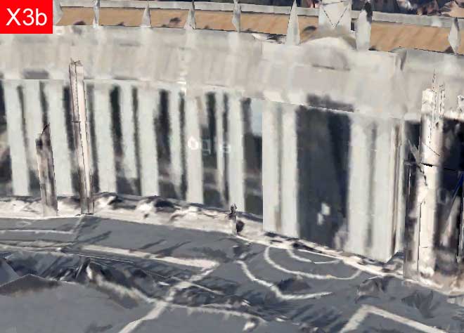
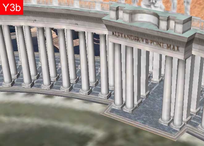
The picture X looks very confused: the terrain is severely deformed, the columns painted on a surface, the statues and the marmoreal balustrade are only roughly sketched.
The picture Y presents an unpleasant visual discontinuity between the plain architecture of the Colonnade and the terrain of the Square, that also is too blurry.
V4) CITY BLOCKS
This view includes city block between St. Peter's and the bend of the Tiber River.
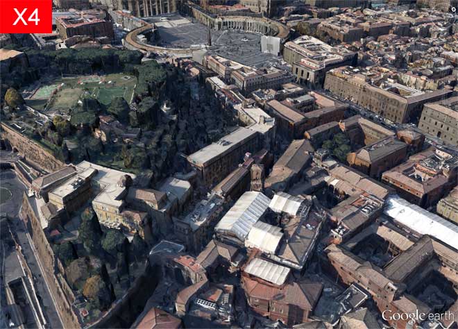
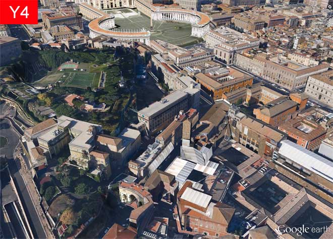
The picture X is well-balanced, with a pleasant green area very realistic. We can see some ongoing work in Bernini's Colonnade.
The picture Y, while incluing many buildings, appears inconsistent with regard to the shadows and deformed in the terrain of the green zone. It is also noted (even from this distance) an annoying "step" wich highlights the misalignment between of the Square and the surrounding terrain.
V4a) CITY BLOCKS - A green area with sports fields
This subview focuses on the green area with sports fields.
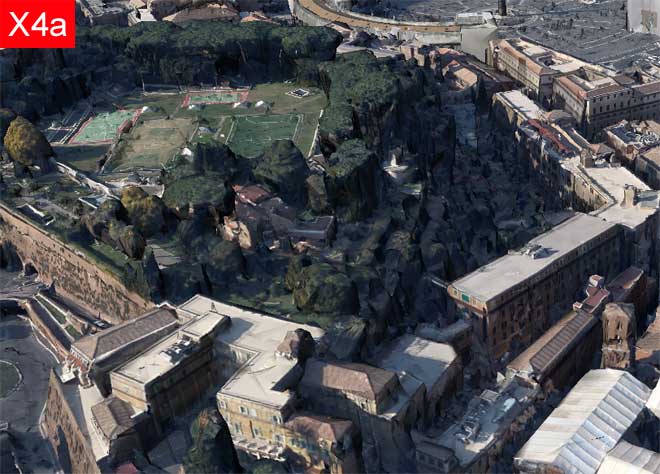
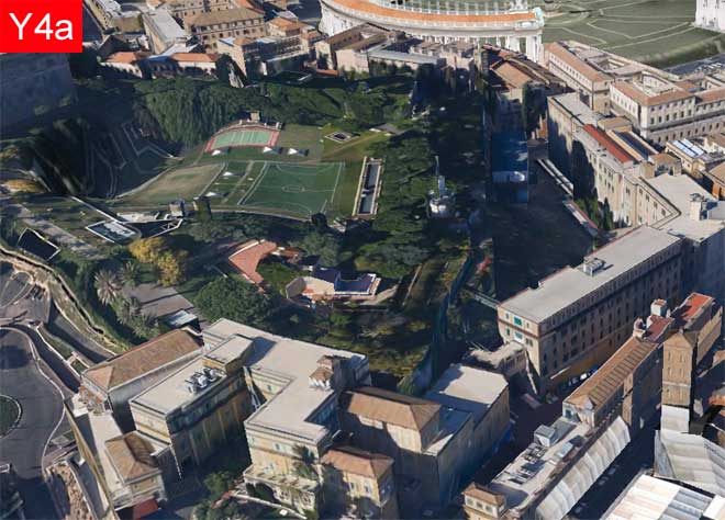
The picture X shows a nice well-recognized green zone with surrounded buildings and ramparts of containment. The trees appear not entirely natural because of their marked angularity.
The picture X shows well defined buildings, but presents a green area with a flat vegetation and serious deformations.
V4b) CITY BLOCKS - Buildings of a city block
This subview focuses on city blocks.
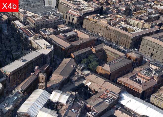
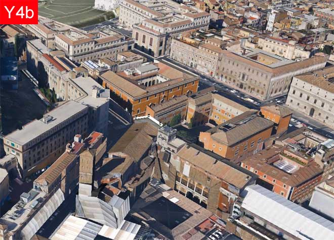
In the picture X the blocks and the buildings are well recognized and with consistent shadows, and we can see numerous trees between the buildings. In some places we notice some anomalies in the shape of the buildings, eg in the bell tower (in the foreground) and in the low-rise buildings farther (in the top right).
In the picture Y the blocks and the buildings appear to be sharp and well defined, with a few "minor" shadows but without "major" shadows, and we notice the absence of trees. At the top left we notice the presence the noticeable step before the Colonnade's Square.
5. The Visual Characteristics of the Scenarios X,Y
In this section we will resume the previously made annotations on the pictures X,Y to draw some general indications about the main characteristics of two scenarios.
For this purpose, we will construct first a summary table in wich, for each picture we will provide three scores to synthesize the visual quality of the images themselves.
Subsequently, driven from the annotations and from the table, we will identify the strengths and weaknesses to try to determine which scenario is - nowadays - more attractive from the visual point of view.
Warning
In this section we have proposed to make a comparison between the scenarios limited to their visual characteristics.
For a more comprehensive comparison between the scenarios the reader is referred to Part 3 of this article.
In this section we have proposed to make a comparison between the scenarios limited to their visual characteristics.
For a more comprehensive comparison between the scenarios the reader is referred to Part 3 of this article.
5.1 The Visual Impression Summary Table
Legend for the table
| First Impression | asterisks indicate the "liking at first sight" of the corresponding picture | |
| Color Impression | asterisks indicate the degree of pleasantness of picture tones and colors (coherence, consistency, realism) | |
| Accuracy Impression | asterisks indicate the degree of precision of picture objects (buildings, architecture, vegetation). Note: for accuracy here we does not mean "compliance with the actual dimensions of the represented objects": this very critical aspect will be considered later in Part 3 |
TABLE 2 - VISUAL IMPRESSIONS ABOUT SCENARIOS X,Y | |||||||||
| View-SubView | Scenario X | Scenario Y | |||||||
| V1) General | X1 | *** | *** | ** | Y1 | ** | *** | ** | |
| V1a) General - St Peter | X1a | ** | *** | ** | Y1a | *** | *** | *** | |
| V1b) General - The river Tiber | X1b | * | *** | * | Y1b | * | *** | * | |
| V2) Facade | X2 | ** | *** | * | Y2 | *** | ** | *** | |
| V2a) Facade - Top and Domes | X2a | - | ** | - | Y2a | *** | ** | *** | |
| V2b) Facade - Bottom right | X2b | - | ** | - | Y2b | ** | *** | *** | |
| V3) Colonnade | X3 | - | *** | - | Y3 | ** | ** | ** | |
| V3a) Colonnade - Roof and behind | X3a | - | **** | - | Y3a | ** | ** | ** | |
| V3b) Colonnade - Gate and columns | X3b | - | * | - | Y3b | ** | ** | ** | |
| V4) City blocks | X4 | *** | *** | ** | Y4 | ** | ** | ** | |
| V4a) City blocks - Green area | X4a | ** | *** | ** | Y4a | *** | *** | ** | |
| V4b) City blocks - Buildings | X4b | ** | *** | * | Y4b | ** | *** | ** | |

Some considerations on the Table 2:
- assigning the scores I tried to be as objective as possible, but nevertheless maybe not all of you will agree with the scores assigned to me, but I hope that your judgment might on average agree with mine
- examining the table, it is not important that we reflect on the individual score but rather that we examine all the values in a column to find the strengths or weaknesses for those visual characteristic of those scenario
- as I have already stated above, the scores I've assigned to the scenarios relate to a particular date (April 2013) but I think that in a few months these values may change (for the better) especially with regard to the Scenario X - at those point I believe that this Table 2, together with the picture that underlie it, can be reused to monitor the state of the art!
- a particular annotation I have to do for the column "Accuracy Impression" of the scenario Y: the scores of only two asterisks (**) are due primarily to the fact that the terrain in Google Earth in the Scenario Y presents (still today) some areas very deformed - were it not for this perception the same views I should assign three asterisks
5.2 Comparing the Scenarios X,Y according to the Visual Impressions
At this point we can venture the comparison.
Scenario X
From the examination of the values in the columns of Table 2 we will immediately notice that the Scenario X has always, for all the pictures, the maximum score for Color Impression because all the picture appear very natural in tones and colors, and with shadows coherent and pronounced that give the image a great realism.
For the First Impressions and Accuracy impressions, instead, the situation is more varied. In practice we may find that the score is high when objects are viewed from a distance while it decreases gradually as we approach to them.
In particular, the score tends to zero when the size of the visual field is of the order of TEN METERS (or less) AND the surface of the object is NOT FLAT - moreover it gets worse the more the real objects are articulated in the spatial dimensions.
Scenario Y
From the examination of the values in the columns of Table 2 we will immediately notice that the Scenario Y has always, for all the pictures, scores more homogeneous than Scenario X.
Almost all of the lower scores are due to deformation in the terrain of Google Earth.
In some pictures we can note some annoying steps in the terrain (see, for example, the Picture Y4): this fact decreases the realism of the view.
Finally, we can note that the pictures of Scenario Y appear in some cases less natural than Scenario X because they have a lower consistency in tone, colors and shadows.
In short we can say that the comparison, limited to visual impressions of a generic user on April-May 2013, is settled in favor of the Scenario Y.
END OF PART 2

From what we have seen so far, the Scenario Y would look the best!
But it's too early to tell - for two reasons.
The first is that we still have to consider many other factors
beyond the simple visual impression of the common man.
The second is that the Scenario X is still in the experimental stage,
and therefore could be subject to significant improvements.
These and other topics will be developed in the forthcoming Part 3
.

Post a Comment