Saturday, May 25, 2013
Auto-generated 3D Models - Appendix A
About St. John auto-generated
Today Sancho is puzzled: he is closely watching, on the experimental area, in Rome, of the new Google Earth version, the auto-generated 3D model of St. John Lateran's Archbasilica.
The model has attracted his attention because it seems significantly different - in a good way - than the auto-generated 3D Models of the surrounding buildings...
In this appendix I will only expose "the facts" ("the images") for two models, leaving the reader - for additional comments and considerations - to PART 4 of my article, which I plan to publish in the course of the next week.
Enrico Dalbosco (Arrigo Silva) - Padova, May 25, 2013
AUTO-GENERATED 3D MODELS
APPENDIX A
ABOUT ST. JOHN AUTO-GENERATED
© Enrico Dalbosco (Arrigo Silva) April-May 2013
Last update: May 25, 2013
Index of contents
PART 1 - ENVIRONMENT
PART 2 - A VISUAL CONFRONTATION
PART 3 - CEZANNE'S LESSON
PART 4 - [... work in process ...]
Appendix A - ABOUT ST. JOHN AUTO-GENERATED <== Current Post
APPENDIX A - ABOUT ST. JOHN AUTO-GENERATED
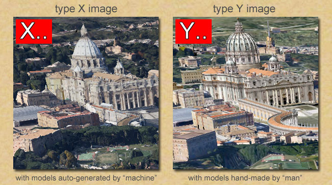
In this appendix we will examine two current models of the Archbasilica St. John Lateran. The first is the auto-generated model as it appears today (24 May 2013) in the experimental area of Rome in Google Earth, and the second is the hand-made model promoted on Photorealistic layer in the Trimble 3D-Warehouse.
L'Arcibasilica Papale di San Giovanni in Laterano
The Papal Archbasilica of St. John Lateran (Italian: Arcibasilica Papale di San Giovanni in Laterano), commonly known as St. John Lateran's Archbasilica, St. John Lateran's Basilica, and just The Lateran Basilica, is the cathedral church of the Diocese of Rome and the official ecclesiastical seat of the Bishop of Rome, who is the Pope.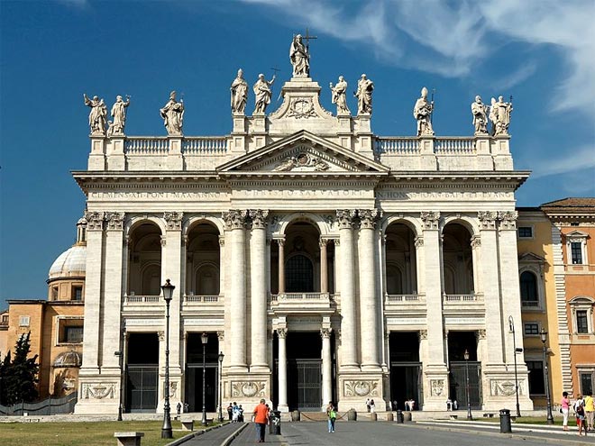
Of the façade by Alessandro Galilei (1735), the cliché assessment has ever been that it is the façade of a palace, not of a church. Galilei's front, which is a screen across the older front creating a narthex or vestibule, does express the nave and double aisles of the basilica, which required a central bay wider than the rest of the sequence; Galilei provided it, without abandoning the range of identical arch-headed openings, by extending the central window by flanking columns that support the arch, in the familiar Serlian motif.
[from WikipediA]
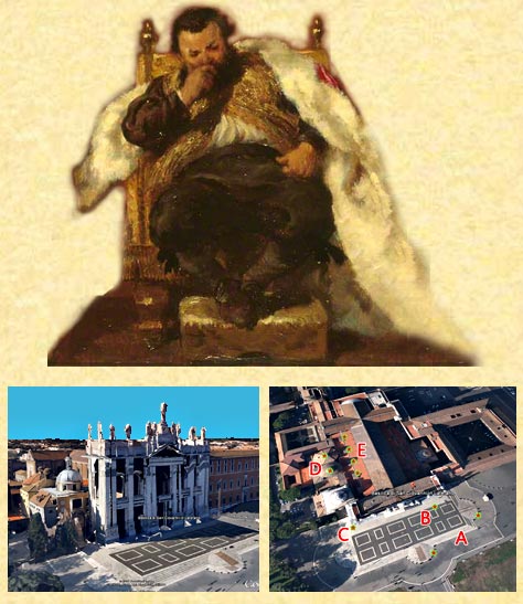
A1. EXPLORING SCENARIO X
Exploring the new version of Google Earth in the experimental area of Rome, you may notice that not all the buildings are made with the same degree of accuracy. In particular you will appreciate some buildings characterized by a greater cleaning: it is the case of St. John Lateran, which emerges from the surrounding landscape, rather approximate (see point "x" in the illustration below), especially for the befitting execution of the southern domes (see point "y").
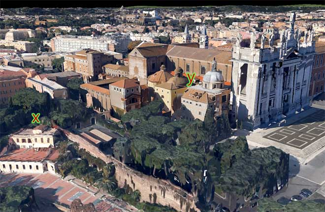
Scenario X - A view from the south-east where we note the good performance of domes "y"
A2. THE AUTO-GENERATED MODEL OF "SAN GIOVANNI IN LATERANO"
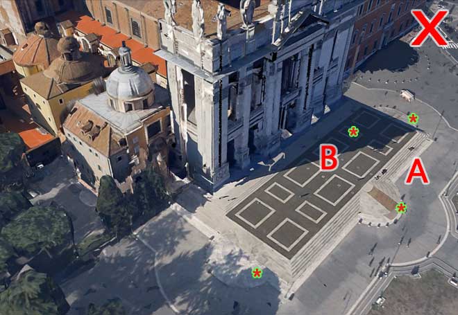
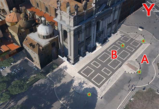
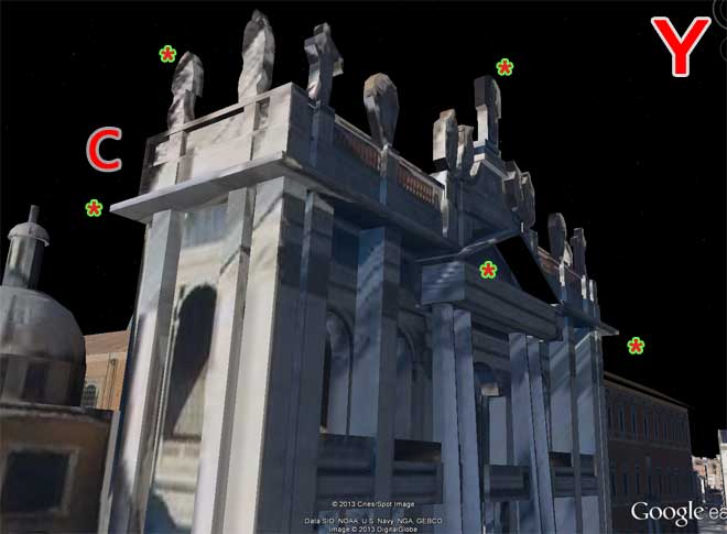
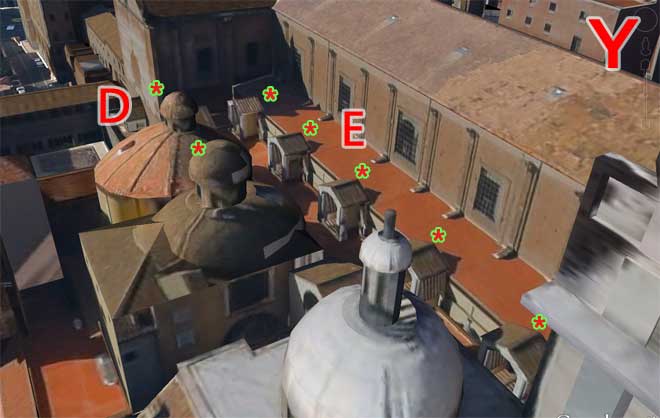
Intrigued by these differences in look, I wanted to investigate the case "San Giovanni", looking closely at the specific points marked (see the following illustration) with A, B, C, D, E.
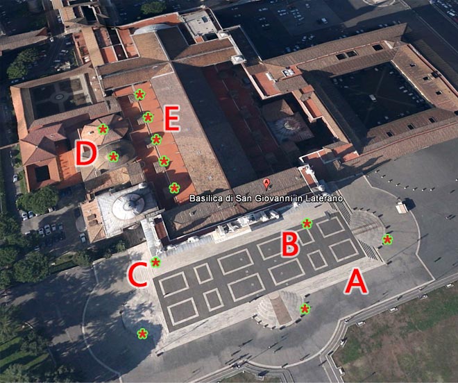
This photo refers to the Google Earth terrain with Photorealistic Layer off-ed at May 24, 2013
And here's a brief description of my observations on these points in the Scenario X (with the auto-generated models):
A - THE SMALL RAMPS
the wide stairway has, in the real world, three elegant small semi-circular ramps, while the model auto-generated shows only the one to the west
B - THE SHADOWS
the photo of the Google Earth's terrain was probably kept about 4:00 PM and so the platform in front of the facade is fully illuminated, while in the 3D auto-generated model it is partially shaded
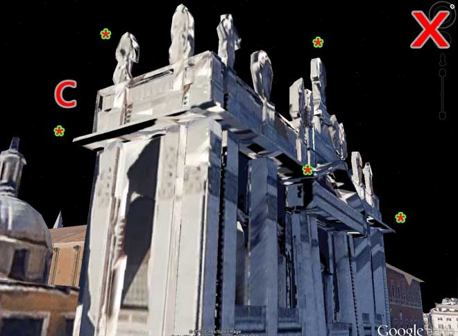
C - THE LEDGES AND STATUES
the facade of the Basilica is very complex, with numerous protrusions and recesses, with gables and eaves and statues; most of these "details" are also present in the model auto-generated, while lacking in almost all other buildings of Scenario X
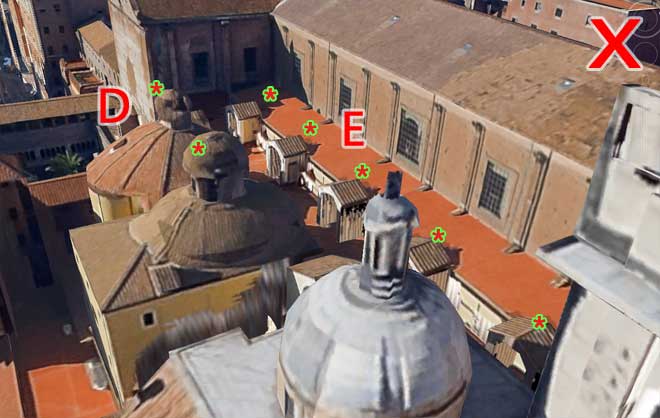
D - THE LITTLE DOMES
the small southern domes of the basilica present the characteristic mushroom shape, which are reproduced in an acceptable way in auto-generated the model, while in many other cases of Scenario X they are not equally reproduced
E - THE SKYLIGHTS
on the southern side of the basilica there are five little skylights that are correctly reproduced in the model auto-generated, while in many other buildings they are not equally well reproduced
The following image shows the points B, C, D on the 3D auto-generated model, as is appears in the new version of Google Earth today May 24, 2013.
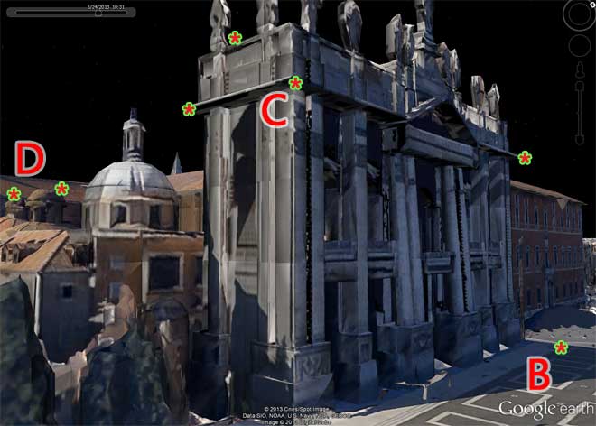
This photo refers to the auto-generated model of the Basilica on Google Earth at May 24, 2013
A3. THE HAND-MADE MODEL OF "SAN GIOVANNI IN LATERANO"
At this point, stimulated by the details C and D, I have performed a search in the Trimble 3D-Warehouse and I found the model shown in the next picture, that - already seen from afar - made me realize to be on the right track.
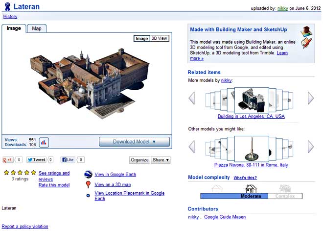
The model of The Lateran Basilica made with Bilding Maker and SketchUp 7 in June 2013.
The model was created June 6, 2012 by the "nikky" user (wich "has not created a profile yet") and last updated June 14, 2012 by the user "Google Guide Mason" (wich similarly "has not created a profile yet").
The most interesting fact is that the model has been created using Building Maker - and this can be investigated by entering the model and extracting the 4 isometric views typical of that tool -, and therefore has been enhanced using SketchUp 7 - as can be seen also by some details related mainly to the domes and ledges.
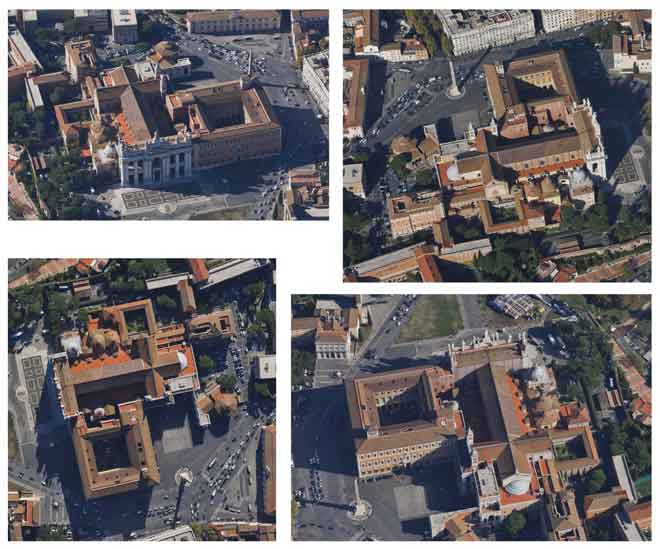
The 4 isometric views of Building Maker extracted from the nikky's model.
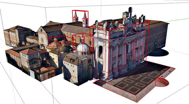
In red there are highlighted some details probably enhanched using SketchUp.
A4. AUTO-GENERATED VS HAND-MADE MODEL OF "SAN GIOVANNI"
In the following couples of images now I provide a comparison between the two models as well as you can see in Scenarios X and Y as at 24 May 2013.
WARNING
hover the mouse over the written X... and Y...
to see the image in the corresponding Scenario
(perhaps you may have to wait a few seconds before you see the Y images)
hover the mouse over the written X... and Y...
to see the image in the corresponding Scenario
(perhaps you may have to wait a few seconds before you see the Y images)
A - THE SMALL RAMPS and B - THE SHADOWS
X hover the mouse to see Scenario X with auto-generated 3D Models
Y hover the mouse to see Scenario Y with hand-made 3D Models
C - THE LEDGES AND STATUES
X hover the mouse to see Scenario X with auto-generated 3D Models
Y hover the mouse to see Scenario Y with hand-made 3D Models
D - THE LITTLE DOMES and E - THE SKYLIGHTS
X hover the mouse to see Scenario X with auto-generated 3D Models
Y hover the mouse to see Scenario Y with hand-made 3D Models

To allow a careful examination, I carry over into the following the three pairs of images:
END OF APPENDIX A
What do you think of this comparison?
How to interpret the similarities and differences?
It 's true that the 'human' modelers will no longer be part of the development of 3D models?
I personally for some time have made a clear idea about these topics - and of course also you would have gained your beliefs.
But on these and other topics we can discuss (probably the next week) in the oncoming Part 4.
.
How to interpret the similarities and differences?
It 's true that the 'human' modelers will no longer be part of the development of 3D models?
I personally for some time have made a clear idea about these topics - and of course also you would have gained your beliefs.
But on these and other topics we can discuss (probably the next week) in the oncoming Part 4.

Tuesday, May 14, 2013
Auto-generated 3D Models - PART 3
Cezanne's Lesson
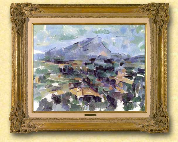
Paul Cézanne, Mont Saint-Victoire (1905) - Oil on canvas, cm 63×83 - Kunsthaus, Zurich
AUTO-GENERATED 3D MODELS
PART 3
CEZANNE'S LESSON
© Enrico Dalbosco (Arrigo Silva) April-May 2013
Last update: May 14, 2013
Index of contents
PART 1 - ENVIRONMENT <== Click Here To Read PART 1!
1. Introduction
2. The most common Scenarios representing the Earth
3. My early observations on the Scenarios
1. Introduction
2. The most common Scenarios representing the Earth
3. My early observations on the Scenarios
PART 2 - A VISUAL CONFRONTATION <== Click Here To Read PART 2!
4. Man VS Machine: A Visual Comparison between Scenarios X,Y
5. The Visual Characteristics of the Scenarios X,Y
5.1 The Visual Impression Summary Table
5.2 Comparing the Scenarios X,Y according to the Visual Impressions
4. Man VS Machine: A Visual Comparison between Scenarios X,Y
5. The Visual Characteristics of the Scenarios X,Y
5.1 The Visual Impression Summary Table
5.2 Comparing the Scenarios X,Y according to the Visual Impressions
PART 3 - CEZANNE'S LESSON <== Current Post
6. Factors influencing the evaluation of the Scenarios
7. "CEZANNE'S LESSON" that is "New ways to representing the world"
7.1 Cezanne as the Great Innovator of European Modern Art
7.2 Google as the Great Innovator of the World Scenarios
6. Factors influencing the evaluation of the Scenarios
7. "CEZANNE'S LESSON" that is "New ways to representing the world"
7.1 Cezanne as the Great Innovator of European Modern Art
7.2 Google as the Great Innovator of the World Scenarios
PART 4 - WHAT FUTURE... ? <== work in process
More about 3D representation / Pros and Cons for the USERS and SUPPLIERS / What future for the current 3D Warehouse modelers? / Conclusions
More about 3D representation / Pros and Cons for the USERS and SUPPLIERS / What future for the current 3D Warehouse modelers? / Conclusions
6. Factors influencing the evaluation of the Scenarios
So far I have identified eight most common Scenarios representing Earth in 3D; among these I have referred to as Scenario X "Google Earth with experimental auto-generated models" and Scenario Y "Google Earth with traditional hand-made models".
For each of the eight scenarios identified I have pointed the supposed degree of interest from various Types of Users - but pausing my judgment just for Scenarios X and Y, waiting for better examine their characteristics.
Then I made a more thorough examination of some the visual characteristics of the Scenarios X,Y comparing several pairs of views of these Scenarios in order to determine which would provide better visual impression - the confrontation showed the Scenario X as winner from the point of view "visual" (on average and as on April-May 2013).
 But now the time has come to consider more thoroughly all the characteristics from the point of view of the users: the only visual impressions do not seem sufficient to determine the final users choice - if you were to go for a picnic in the countryside, which car would you choose?
So let me present the other characteristics somehow appreciated by the users.
TABLE 3 - THE CHARACTERISTICS OF A SCENARIO (A MORE COMPLETE LIST)
A) VISUAL IMPRESSIONS
A1) Firts impression = impression "at first sight"
A2) Color impression = evaluation about tones and colors (natural, well-tuned)
A3) Accuracy impression = evaluation of the degree of detail and pleasantness of the objects (buildings, architecture, vegetation)
C) CONTESTUAL FEATURES AVAILABILITY
C1) Swithcing to other Scenario = ability to switch to alternative representations of the current area (or in the current area)
C2) Contestual infos/links = presence of hot spots that provide further related information in the same Scenario application or through links to other applications
D) OTHER CHARACTERISTICS
D1) AREAS COVERED BY THE SCENARIO = Scenario’s Extension in the World
D2) HW/SW SUPPORTING THE SCENARIO = Scenario's Availability on various hardware devices with different Sperating Systems, Access time to download a Scenario's view, etc.
D3) COSTS = Any possibile costs (of subscription, access, etc.)
A1) Firts impression = impression "at first sight"
A2) Color impression = evaluation about tones and colors (natural, well-tuned)
A3) Accuracy impression = evaluation of the degree of detail and pleasantness of the objects (buildings, architecture, vegetation)
B) COMPLIANCE WITH THE REALITY
B1) Dimension compliance = dimensional correspondence between the represented objects and the real objects (geographic coordinates, physical dimensions such as heights, widths, etc.)
This characteristics may be further decomposed in:
B10) GIS compliance
B11) Macro dimension compliance (or G0 compliance)
B12) Micro dimension compliance (or Gn compliance) at various levels of detail, where with G0=Geometry essential, G1=Geometry at first level of detail, etc. (for more info refer to my article My Method For Classifying 3D Models)
B2) Textures compliance = visual correspondence between the represented objects and the real appearence of the corresponding textures of the real objects
B3) Time compliance = time correspondence between the represented view and the corresponding view as "today" in the real world (live, to a previous [specified] time)
C) CONTESTUAL FEATURES AVAILABILITY
C1) Swithcing to other Scenario = ability to switch to alternative representations of the current area (or in the current area)
C2) Contestual infos/links = presence of hot spots that provide further related information in the same Scenario application or through links to other applications
D) OTHER CHARACTERISTICS
D1) AREAS COVERED BY THE SCENARIO = Scenario’s Extension in the World
D2) HW/SW SUPPORTING THE SCENARIO = Scenario's Availability on various hardware devices with different Sperating Systems, Access time to download a Scenario's view, etc.
D3) COSTS = Any possibile costs (of subscription, access, etc.)
In this table, I wanted to specifically highlight the entries for the Compliance with the reality for the following reasons:
- these entries, after the already analyzed Visual impressions, are those that have the greatest significance on our Scenarios X,Y
- in my opinion, the two Scenarios X,Y have some natural propensities toward the "Compliance with the reality" - and of these propensities we need to take into account in the evaluation of the scenarios
To understand the importance - and the dissimilarity - of the innate characteristics toward Compliance with the Reality in the two Scenarios, it is sufficient to consider the "Case of Works in Progress":
The Scenario X inherently represents "works in progress", while for the Scenario Y really few human modelers (or nobody) would have included the "works in progress" in their own models...
And maybe there are some users interested JUST in works in progress!
THE ANGLE OF THE ART: PAUL CEZANNE
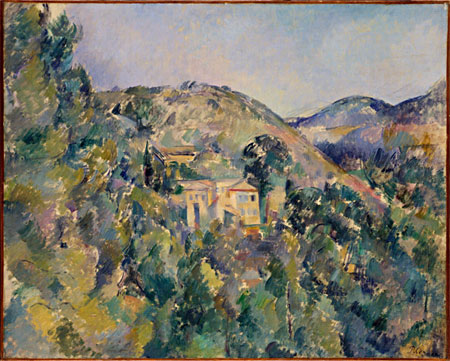
Paul Cézanne, View of the Domaine Saint-Joseph, late 1880s - Oil on canvas (65.1 x 81.3 cm)
The Metropolitan Museum of Art, New York, Catharine Lorillard Wolfe Collection, Wolfe Fund
The Metropolitan Museum of Art, New York, Catharine Lorillard Wolfe Collection, Wolfe Fund
Paul Cézanne (Aix-en-Provence, 1839-1906) was a French artist and Post-Impressionist painter whose work laid the foundations of the transition from the 19th-century conception of artistic endeavour to a new and radically different world of art in the 20th century. Cézanne can be said to form the bridge between late 19th-century Impressionism and the early 20th century's new line of artistic enquiry, Cubism. Both Matisse and Picasso are said to have remarked that Cézanne "is the father of us all." [from WikipediA]
7. "CEZANNE LESSON" that is "New ways to representing the world"
But now allow me to abandon, for a few screens, the "boring" topic of 3D modeling to venture "unashamedly" into the fascinating world of figurative arts exploring the arcane relationship between art and technology - and finding some unexpected exciting similarities and differences...
7.1 Cezanne as the Great Innovator of European Modern Art
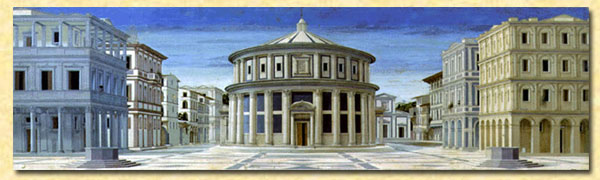 The starting point of my brief digression is the painting of Ideal City (second half of the XIV century) which can be considered the graphic manifesto of the Renaissance. In this "most perfect" painting, the space is marked with extreme rigor: everything is perfectly geometric, calculated, distributed, distinguished. These characteristics, enhanced by the strict application of the perspective, have imprintied and permeated (with some exceptions) all subsequent European artistic expressions since the nineteenth century.
The world of the Ideal City was the world of rationality, composure, of the perfect geometry and perspective, with well-finished and well-defined objects.
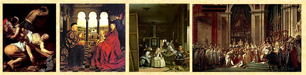
For several centuries, in fact, European painters sought to depict the world with sharpness, marking the contours of the objects and taking all the expedients to make objects distinguishable and realistic, as we can see from the following examples.
 But in the first half of the nineteenth century, the peaceful life of the academic painters was unsettled by a new amazing invention, Photography, that constituted a tremendous step forward in the realistic representation of the world (since 1838 Daguerre could take pictures like the one shown to the left!).
The art, or rather the science of photography in a few decades made such rapid progress that the "academic" painters saw jeopardized their reputation from a vulgar "machine" and from a few chemical processes! For more, photographic technique continued to improve, and met the favor of the public... In order not to "lose their job" (sorry for the trivialization... ;) the painters had to create something that the camera could not produce - this was perhaps one of the reasons that led some more sensitive painters to invent a new way of painting, putting on canvas what the cameras and photographers could not...
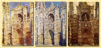 So it was that the Impressionists enriched their representations of the world no longer by painting objects well-distinct and separate from each other (which was a typical and reassuring characteristic of the "good" ancient painting) but enriching them with the atmosphere they had around, blurring the boundaries and breaking the rigid distinction between object and object, and between objects and air.
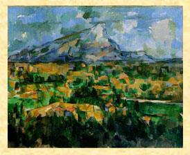 But the true great innovator can be considered Paul Cézanne (1839-1906). In the painting of Cezanne the objects represented on the canvas "take space", their volumes burst and invade the surrounding space establishing between themself a dialogue that meets the needs of the art... thus favoring the emergence of all the contemporary artistic trends.
With Cezanne ends the perfect world, the world of geometry and perspective, with well-finished and well-defined objects.
And, of course, as almost always happens to innovators, Cezanne was not immediately understood...7.2 Google as the Great Innovator of the World Scenarios
[I want to state clearly here that the any facts, opinions and assessments expressed in this paragraph are quite strictly personal.]
 Early in the history - year of our Lord 2006 - the (Google) Earth was deserted and no model populated the Earth. But then came 3DWarehouse, who invited many willing people to create 3D models using the powerful 3D tool SketchUp (free of charge) and, a few years later (2010) the [minus] powerful tool Building Maker (also free of charge).
Thus arose and populated the Earth, in every part of the world, hundreds, thousands, hundreds of thousands of models of (mostly) "stable objects" such as houses, mills, churches, cathedrals, mosques, pagodas, temples... produced from an increasing number of human modelers.
 These modelers were very heterogeneous, often simply fans of 3D, in some cases professionals, in other beginners - all of them eager to bring up, almost always selflessly, their models on the famous "Photorealistic Layer" of Google Earth [Note: it was set up a special committee sifted the models worthy of being accepted on Google Earth].
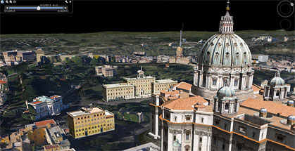
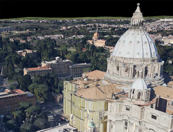
The right image shows an example of those I have called Scenario Y that is Google Earth with "hand-created" 3D Models. The area represented is located near St. Peter in Vatican City (Rome), and the models were made by 3D modelers as Aerilius, Arrigo Silva, Chigirinsky, kevinwilkins, lucachapy etc. and other "anonymous" 3D modelers or 3D Modeling Companies.
The world of the Scenario Y is populated by models of "preferably stable objects" build with different criteria and different styles, but in any case hand-made one by one and quite distinct from each other.
Meanwhile...
... the Scenarios (see also Section 2.) increased in number, in quality and in quantity of areas covered, in interest from the users...
... the cpmpeting companies put in place new strategies...
... the SketchUp and the 3DWarehouse Gallery passed from Google to Trimble...
... technologies have made great strides in every sector related to the Scenarios (GIS, duplication of physical objects, automatic generation of 3D models etc.)...
...
Although I do not have a thorough knowledge of these phenomena, and even first-hand news, nevertheless I sense that the moment has been and is still very critical...
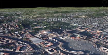
At this point Google had an innovative and revolutionary idea: to break with the world of Scenarios hand-made, with a few countable models made one-by-one by many different modelers, but to devise a new paradigm, a new Vision (that I have called Scenario X that is Google Earth with "auto-generated" 3D Models)...
...that can hold all the objects of the world, without distinction between stable or unstable objects and without hierarchy of importance between the objects represented.
With the Google Scenario X ends the world
of well-finished and well-defined models.
Scenario X aspires to represent the Earth
"as it is [appears] at a given time [instant]"
taking a huge mega-3D-shot, where everything is recorded: monuments, houses, churches, mosquees, roads, bridges, trees, works in progress, cars, trains...
The important is not to "represent something in detail":
the important is to "represent everything in its place".
I consider this Google's strategy worthy of the highest respect, and look with confidence the next steps: the road is drawn, it is still long and not easy, but - I am sure - there will be benefits for all, as I shall try to demonstrate in the next sections.
The strange idea of combining Cezanne and Google came to me while I was carefully examining the Google Earth Scenarios X (with auto-generated models) in the experimental areas of Rome, New York and Tokyo (April 2013). To be honest, at the beginning I felt a bit of annoyance at seeing those outlandish landscapes... but then I got used to them, and indeed I saw something artistic which reminded me, as a passionate of ancient and modern painting, something familiar... similar to... the style of Cezanne!
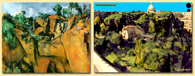
Upon closer inspection of this... odd couple, beyond the obvious differences (Cezanne was a great painter of the past, while Google is a large and powerful company of our days, etc.) I found some interesting similarities especially in the courage to introduce a new paradigm, to break with previous established traditions and especially to give up a world made of objects clear and distinct.
And finally, perhaps for a strange combination, the "graphical results" of their "experiments" look almost similar, although I must say that the style of Cezanne, from the artistic point of view, seems to me perfect, while that of Google Earth, from the user point of view, seems still too uncertain...
Late 1800s Cezanne changes the way to describing the world - Early 2010s Google too!
And finally, perhaps for a strange combination, the "graphical results" of their "experiments" look almost similar, although I must say that the style of Cezanne, from the artistic point of view, seems to me perfect, while that of Google Earth, from the user point of view, seems still too uncertain...
END OF PART 3
From what we have seen in this PART 3, Scenario X could present some interesting features, at least for some types of Users...
On the other hand Scenario Y seems to be more reassuring...
And then we have to think also to the Suppliers...
But perhaps the next and final PART 4 will reserve us more food for thought!
.
Saturday, May 4, 2013
Auto-generated 3D Models - PART 2
Spot the difference!
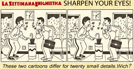 "Sharpen your eyes!" is the title of a fun pastime for young and old that is published weekly by the more common Italian magazine of Enigmistica "La Settimana Enigmistica".
In this case we have to find 20 different small details in two almost identical cartoons showing two people who compete for one model... oops... umbrella! ;)
A little game that I do with pleasure from time to time, and that today I'll just play with you on a different type of cartoons, as you will have the patience to read, in the following, the second part of "Auto-generated 3D Models".
"Sharpen your eyes!" is the title of a fun pastime for young and old that is published weekly by the more common Italian magazine of Enigmistica "La Settimana Enigmistica".In this case we have to find 20 different small details in two almost identical cartoons showing two people who compete for one model... oops... umbrella! ;)
A little game that I do with pleasure from time to time, and that today I'll just play with you on a different type of cartoons, as you will have the patience to read, in the following, the second part of "Auto-generated 3D Models".
AUTO-GENERATED 3D MODELS
PART 2
A VISUAL COMPARATION
© Enrico Dalbosco (Arrigo Silva) April-May 2013
Last update: May 4, 2013
Index of contents
PART 1 - ENVIRONMENT <== Click Here To Read PART 1!
1. Introduction
2. The most common Scenarios representing the Earth
3. My early observations on the Scenarios
1. Introduction
2. The most common Scenarios representing the Earth
3. My early observations on the Scenarios
PART 2 - A VISUAL CONFRONTATION <== Current Post
4. Man VS Machine: A Visual Comparison between Scenarios X,Y
5. The Visual Characteristics of the Scenarios X,Y
5.1 The Visual Impression Summary Table
5.2 Comparing the Scenarios X,Y according to the Visual Impressions
4. Man VS Machine: A Visual Comparison between Scenarios X,Y
5. The Visual Characteristics of the Scenarios X,Y
5.1 The Visual Impression Summary Table
5.2 Comparing the Scenarios X,Y according to the Visual Impressions
PART 3 - WHAT FUTURE... ? <== work in process
More about 3D representation / Factors which influence the evaluation of the Scenarios / Pros and Cons for the USERS and SUPPLIERS / What future for the current 3D Warehouse modelers? / Conclusions
More about 3D representation / Factors which influence the evaluation of the Scenarios / Pros and Cons for the USERS and SUPPLIERS / What future for the current 3D Warehouse modelers? / Conclusions
4. Man VS Machine: A visual comparison between Scenarios X,Y (April 2013)
The pictures of the Scenarios that will be shown and compared in this section refer to the city of Rome, and specifically to the St. Peter's Basilica and its surroundings located partially in the State of the Vatican and partially in Italy.
The comparison will be made between pictures taken from the Scenarios X and Y, previously described in Part1>Section 2.
 The pictures taken from the Scenario X will be named "X pictures" and are obtained from Google Earth enabling the visualisation of the auto-generated 3D Models.
The pictures taken from the Scenario Y will be named "Y pictures" and are obtained from Google Earth enabling the visualisation of the man-made 3D Models.
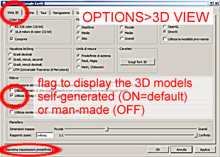
I got both types of images on my personal computer using Google Earth Version 7.0.2 for Windows Vista; for the "X pictures" I've set the option flag to ON (see the picture on the right) [unfortunately this is the default option for my Version of GE...], while for the "Y pictures" I've set the option flag to OFF.
The diagram below shows all the images that will be displayed later in this section (all the pictures have the same format of 660x474 pixels).
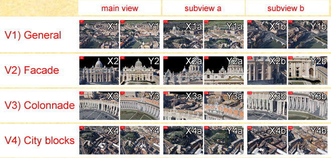
There are a total of 24 pictures that relate to 12 views - for each view will be shown a pair of images, organized and named according to the following criteria:
- I have chosen four main views: V1) General, V2) Facade, V3) Colonnade, V4) City blocks
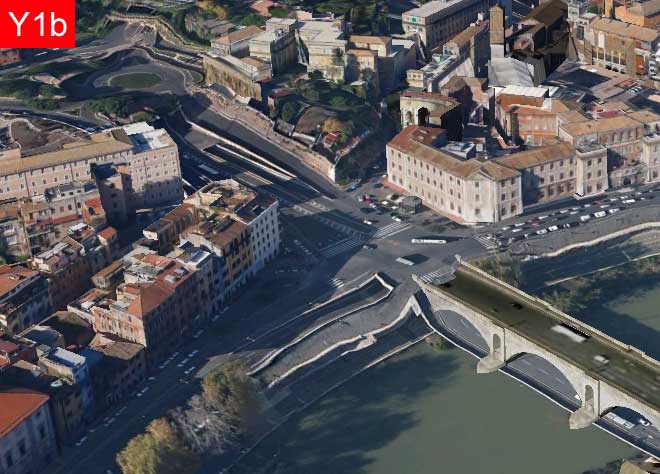
- For each main View I identified two subviews "interesting", eg for V1) General I identified two views, V1a) with the Basilica and the Square and V1b) with the river Tiber
- For each view I have provided the two versions: "machine" with the prefix X and "man" with the prefix Y - so for the view V1) we have the two images X1 and Y1 , for the view V1a) we have X1a and Y1a , etc.
In the remainder of this section, I present the 12 pairs of pictures, providing for each a few notes, and referring the reader to the next section for a first summary of the various considerations that emerged from this analysis.
Warning 1
The pictures are been chosen to include: structured artifacts as artistic buildings, historical buildings, residential buildings; civil works such as roads, bridges, embankments, walls, sports fileds and natural features such as rivers, meadows, trees etc.
I think that the pictures choosen would cover almost all of the typical situations.
Warning 2
The comments on the pictures are made trying to watch them through the eyes of an ordinary person ("the man in the street"), without considering possible specializations as "the business man", "the tourist", "the art lover", "the urban planner", etc. and even less "the 3D modeler!"
Even with this simplification, I think that the comments can be equally significant.
Warning 3
It is important to emphasize that the image size has a great influence in the proceedings and in comparison of pairs of images, especially as regards the appreciation and evaluation of the degree of detail.
So if you're reading this article on a different device (phone, tablet, etc..) your feelings and considerations could 'legitimately' be discordant from mine...
The pictures are been chosen to include: structured artifacts as artistic buildings, historical buildings, residential buildings; civil works such as roads, bridges, embankments, walls, sports fileds and natural features such as rivers, meadows, trees etc.
I think that the pictures choosen would cover almost all of the typical situations.
Warning 2
The comments on the pictures are made trying to watch them through the eyes of an ordinary person ("the man in the street"), without considering possible specializations as "the business man", "the tourist", "the art lover", "the urban planner", etc. and even less "the 3D modeler!"
Even with this simplification, I think that the comments can be equally significant.
Warning 3
It is important to emphasize that the image size has a great influence in the proceedings and in comparison of pairs of images, especially as regards the appreciation and evaluation of the degree of detail.
To be more precise we can say that the main elements that contribute to the determine the degree of sharpness of vision are: the size in pixels of the image, the zoom factor used in the visualization, the size of the pixels on the screen, its brightness etc. etc. and finally the distance from which the screen is watched).
My evaluations were made just on the pictures presented below of 660x474 pixels using the screen of my Personal Computer on which each picture has a size of about 16,5x12,0 cm - and seeing the pictures from about 50 cm.So if you're reading this article on a different device (phone, tablet, etc..) your feelings and considerations could 'legitimately' be discordant from mine...
V1) GENERAL
This first view is a "long shot" of St. Peter's with a close up on the bend of the Tiber River.
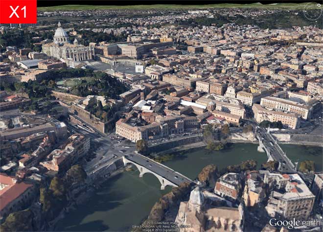
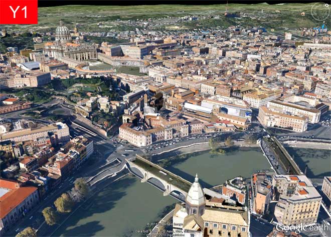
The picture X appears even and well-balanced in colors and looks very realistic, even if we can a few imperfections in the church at the bottom and the "strange" form of the St. Peter's big dome. The effect of "realism" is reinforced by details such as the presence of numerous trees and the consistency of the shadows.
In the picture Y our attention is immediately drawn to the deformations of the river banks. At the same time it must be noted, however, that the buildings appear geometrically well-defined and properly colored. We notice also the absense of 3D vegetation.
V1a) GENERAL - Saint Peter
This subview focuses on the St. Peter (the Basilica, the Square, the Bernini's Colonnade) and on the immediate surroundings.
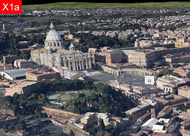
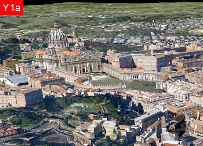
The picture X appear very natural (with the exception of the "strange" form of the St. Peter's big dome). The effect of "realism" is reinforced by the presence of "work in progress" on Bernini's Colonnade and of the wide and varied green area on the left.
The picture Y appears well defined in the architectures and textures of the Basilica, the Colonnade and buildings, even if we notice the lack of shadows and the alarming terrain deformations especially in the green area to the left.
V1b) GENERAL - The river Tiber
This subview focuses on the bend of Tiber River and its surroundings.
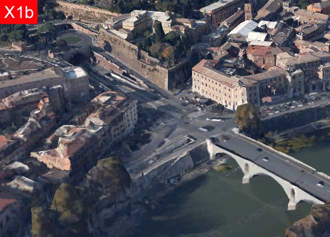
In the picture X the layout of the road works, the banks of the river and the bridge looks realistic, while the buildings on the bottom left look deformed.
In the picture Y the buildings look detailed, while the layout of the road works etc. looks deformed.
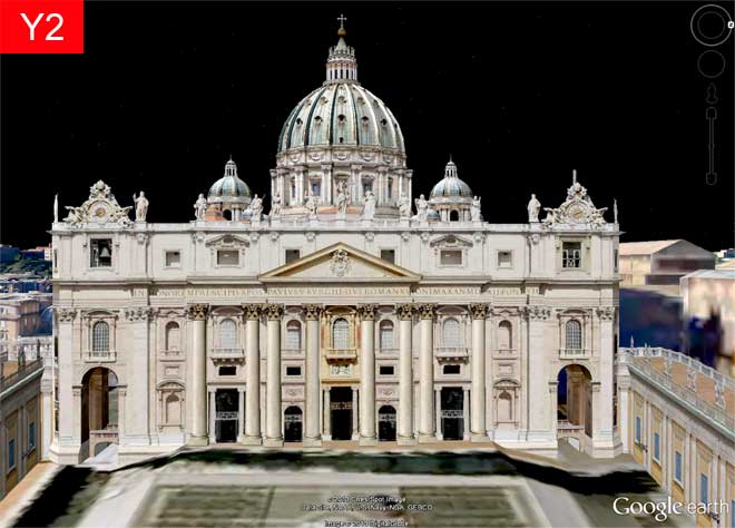
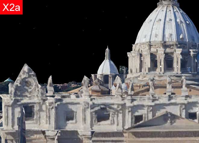
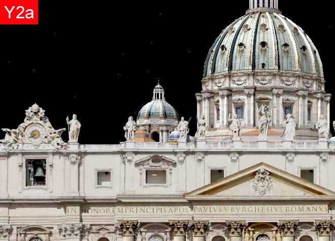
V2) ST. PETER'S FACADE
This view is a close-up of the facade of St. Peter's Basilica behind which you can see the big dome and two smaller domes.
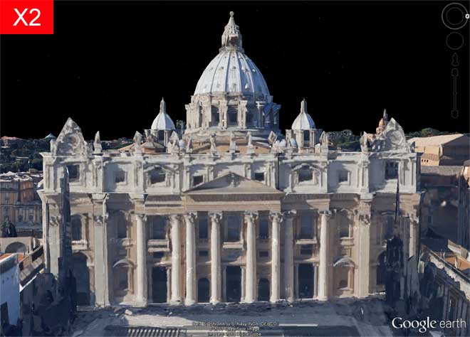
In the picture X the facade of the Basilica and the Domes appear roughly sketched and a little irregular; in return, the general tone of light and colors appears pleasant and realistic. The hazy structures on the left and on the right make us realize that there are some works in progress.
In the picture Y the definition and precision of the geometry and the sharpness of the images allow us to follow the architectural details of the facade and the domes.
V2a) FACADE - The top of the facade and the domes
This subview focuses on the left top of the facade and the domes.
In the picture X the definition and precision of geometry and textures don't allow to read the architectural structures and rhythms and don't allow to decipher the details of the order of fraction of a meter, thus making the various statues above the facade not decipherable.
In the picture Y the definition and precision of the geometry and the sharpness of the textures allow us to follow the architectural details of the facade and the domes.
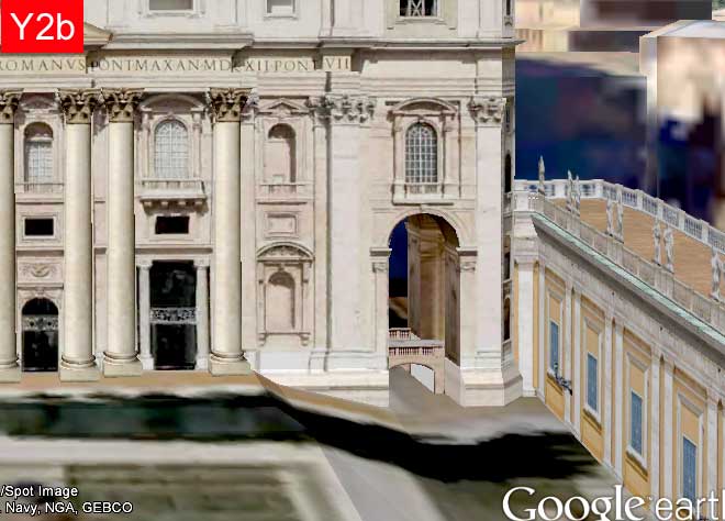
V2b) FACADE - The corner at the bottom right
This subview focuses on the right bottom of the facade.
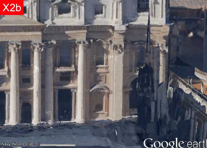
In the picture X the definition and precision of geometry and textures don't allow to read the architectural structures and rhythms particularly at the junction of the facade with the building on the right: the situation is indecipherable due to the presence of works in progress.
In the picture Y the definition and precision of the geometry and the sharpness of the textures allow us to follow the architectural details of the facade and the domes. It should be noted, however, that the shadows on the ground are incongruent with the lack of shadows on the facade and on the building on the right.
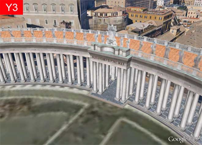
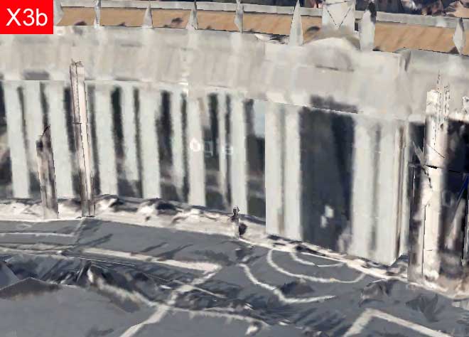
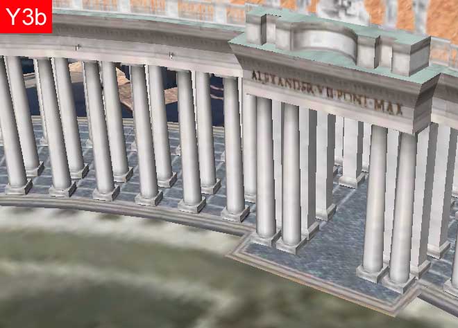
V3) BERNINI'S COLONNADE
This view is a close-up of the northern central gate of Bernini's Colonnade behind which we can see various buildings of Vatican City and Rome.
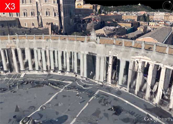
In the picture X appear several inaccuracies and inconsistencies in the visual field of the terrain of the Square, in the structure of the columns and in the building on the left.
The picture Y appears very well defined with regard to the architecture but less defined with regard to the balustrade and the statues and too blurred regarding the terrain of the Square.
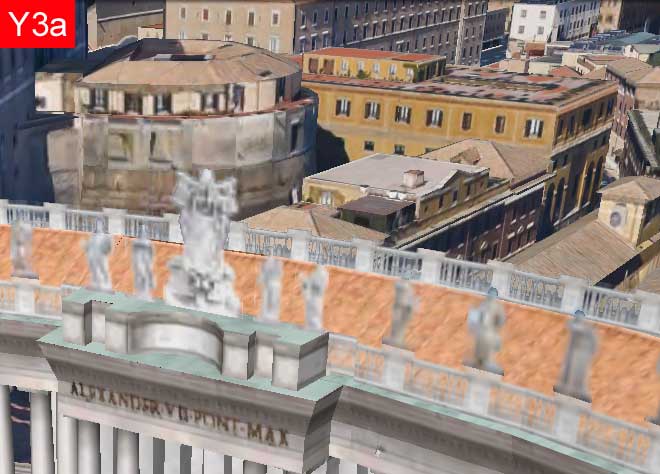
V3a) COLONNADE - The roof and the buildings behind
This subview focuses on the top of the northern gate of the Colonnade including the buildings behind.
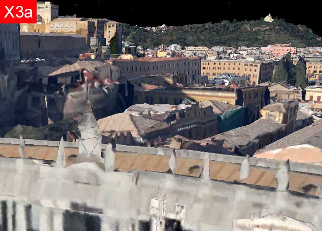
In the picture X the foreground looks very confused both as regards to the Colonnato that the buildings behind.
In the picture Y the statues are poorly defined and blurred.
V3b) COLONNADE - The columns and a gate for the crossing
This subview focuses on the northern gate of the Colonnade.
The picture X looks very confused: the terrain is severely deformed, the columns painted on a surface, the statues and the marmoreal balustrade are only roughly sketched.
The picture Y presents an unpleasant visual discontinuity between the plain architecture of the Colonnade and the terrain of the Square, that also is too blurry.
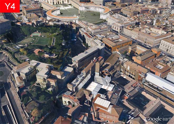
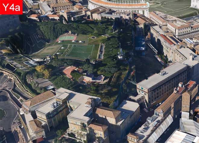
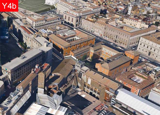
V4) CITY BLOCKS
This view includes city block between St. Peter's and the bend of the Tiber River.
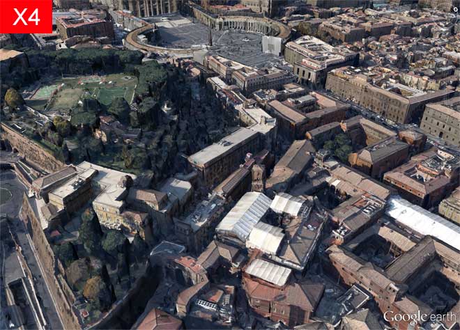
The picture X is well-balanced, with a pleasant green area very realistic. We can see some ongoing work in Bernini's Colonnade.
The picture Y, while incluing many buildings, appears inconsistent with regard to the shadows and deformed in the terrain of the green zone. It is also noted (even from this distance) an annoying "step" wich highlights the misalignment between of the Square and the surrounding terrain.
V4a) CITY BLOCKS - A green area with sports fields
This subview focuses on the green area with sports fields.
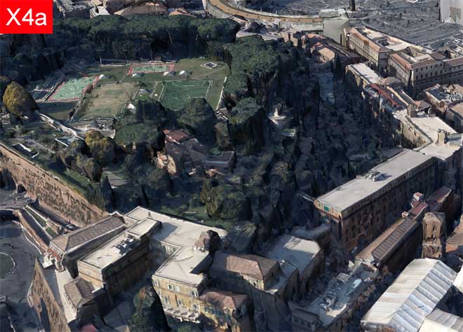
The picture X shows a nice well-recognized green zone with surrounded buildings and ramparts of containment. The trees appear not entirely natural because of their marked angularity.
The picture X shows well defined buildings, but presents a green area with a flat vegetation and serious deformations.
V4b) CITY BLOCKS - Buildings of a city block
This subview focuses on city blocks.
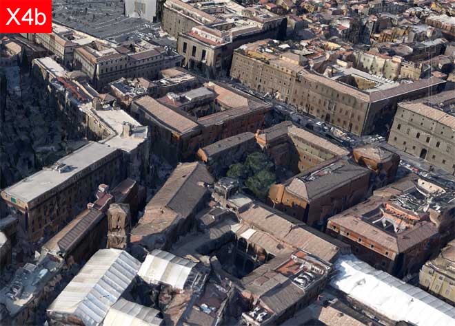
In the picture X the blocks and the buildings are well recognized and with consistent shadows, and we can see numerous trees between the buildings. In some places we notice some anomalies in the shape of the buildings, eg in the bell tower (in the foreground) and in the low-rise buildings farther (in the top right).
In the picture Y the blocks and the buildings appear to be sharp and well defined, with a few "minor" shadows but without "major" shadows, and we notice the absence of trees. At the top left we notice the presence the noticeable step before the Colonnade's Square.
5. The Visual Characteristics of the Scenarios X,Y
In this section we will resume the previously made annotations on the pictures X,Y to draw some general indications about the main characteristics of two scenarios.
For this purpose, we will construct first a summary table in wich, for each picture we will provide three scores to synthesize the visual quality of the images themselves.
Subsequently, driven from the annotations and from the table, we will identify the strengths and weaknesses to try to determine which scenario is - nowadays - more attractive from the visual point of view.
Warning
In this section we have proposed to make a comparison between the scenarios limited to their visual characteristics.
For a more comprehensive comparison between the scenarios the reader is referred to Part 3 of this article.
In this section we have proposed to make a comparison between the scenarios limited to their visual characteristics.
For a more comprehensive comparison between the scenarios the reader is referred to Part 3 of this article.
5.1 The Visual Impression Summary Table
Legend for the table
| First Impression | asterisks indicate the "liking at first sight" of the corresponding picture | |
| Color Impression | asterisks indicate the degree of pleasantness of picture tones and colors (coherence, consistency, realism) | |
| Accuracy Impression | asterisks indicate the degree of precision of picture objects (buildings, architecture, vegetation). Note: for accuracy here we does not mean "compliance with the actual dimensions of the represented objects": this very critical aspect will be considered later in Part 3 |
TABLE 2 - VISUAL IMPRESSIONS ABOUT SCENARIOS X,Y | |||||||||
| View-SubView | Scenario X | Scenario Y | |||||||
| V1) General | X1 | *** | *** | ** | Y1 | ** | *** | ** | |
| V1a) General - St Peter | X1a | ** | *** | ** | Y1a | *** | *** | *** | |
| V1b) General - The river Tiber | X1b | * | *** | * | Y1b | * | *** | * | |
| V2) Facade | X2 | ** | *** | * | Y2 | *** | ** | *** | |
| V2a) Facade - Top and Domes | X2a | - | ** | - | Y2a | *** | ** | *** | |
| V2b) Facade - Bottom right | X2b | - | ** | - | Y2b | ** | *** | *** | |
| V3) Colonnade | X3 | - | *** | - | Y3 | ** | ** | ** | |
| V3a) Colonnade - Roof and behind | X3a | - | **** | - | Y3a | ** | ** | ** | |
| V3b) Colonnade - Gate and columns | X3b | - | * | - | Y3b | ** | ** | ** | |
| V4) City blocks | X4 | *** | *** | ** | Y4 | ** | ** | ** | |
| V4a) City blocks - Green area | X4a | ** | *** | ** | Y4a | *** | *** | ** | |
| V4b) City blocks - Buildings | X4b | ** | *** | * | Y4b | ** | *** | ** | |
Some considerations on the Table 2:
- assigning the scores I tried to be as objective as possible, but nevertheless maybe not all of you will agree with the scores assigned to me, but I hope that your judgment might on average agree with mine
- examining the table, it is not important that we reflect on the individual score but rather that we examine all the values in a column to find the strengths or weaknesses for those visual characteristic of those scenario
- as I have already stated above, the scores I've assigned to the scenarios relate to a particular date (April 2013) but I think that in a few months these values may change (for the better) especially with regard to the Scenario X - at those point I believe that this Table 2, together with the picture that underlie it, can be reused to monitor the state of the art!
- a particular annotation I have to do for the column "Accuracy Impression" of the scenario Y: the scores of only two asterisks (**) are due primarily to the fact that the terrain in Google Earth in the Scenario Y presents (still today) some areas very deformed - were it not for this perception the same views I should assign three asterisks
5.2 Comparing the Scenarios X,Y according to the Visual Impressions
At this point we can venture the comparison.
Scenario X
From the examination of the values in the columns of Table 2 we will immediately notice that the Scenario X has always, for all the pictures, the maximum score for Color Impression because all the picture appear very natural in tones and colors, and with shadows coherent and pronounced that give the image a great realism.
For the First Impressions and Accuracy impressions, instead, the situation is more varied. In practice we may find that the score is high when objects are viewed from a distance while it decreases gradually as we approach to them.
In particular, the score tends to zero when the size of the visual field is of the order of TEN METERS (or less) AND the surface of the object is NOT FLAT - moreover it gets worse the more the real objects are articulated in the spatial dimensions.
Scenario Y
From the examination of the values in the columns of Table 2 we will immediately notice that the Scenario Y has always, for all the pictures, scores more homogeneous than Scenario X.
Almost all of the lower scores are due to deformation in the terrain of Google Earth.
In some pictures we can note some annoying steps in the terrain (see, for example, the Picture Y4): this fact decreases the realism of the view.
Finally, we can note that the pictures of Scenario Y appear in some cases less natural than Scenario X because they have a lower consistency in tone, colors and shadows.
In short we can say that the comparison, limited to visual impressions of a generic user on April-May 2013, is settled in favor of the Scenario Y.
END OF PART 2
From what we have seen so far, the Scenario Y would look the best!
But it's too early to tell - for two reasons.
The first is that we still have to consider many other factors
beyond the simple visual impression of the common man.
The second is that the Scenario X is still in the experimental stage,
and therefore could be subject to significant improvements.
These and other topics will be developed in the forthcoming Part 3
.
![]()
