Thursday, April 15, 2010
Rockwell’s Candies - My Personal Checklist
A PERSONAL APPROACH TO 3D MODEL EVALUATION
 Almost daily I spend a bit of time to examine and evaluate 3D warehouse models - churches, buildings and monuments etc. I find this activity is particularly exciting because I can know new interesting models and modelers and new challenging technical or artistical solutions.
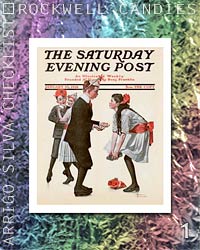
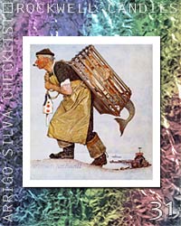
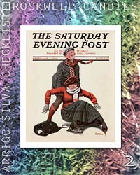
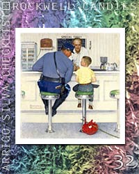
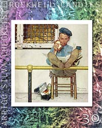
In this first article about evaluation I put aside some of my thoughts which I gave the name of Checklist and that I wanted to associate to two things for me - and hopefully for you - very pleasing: the Sweets and the beautiful, tender, spirit and humorous Paintings by the great American artist Norman Rockwell.
Norman Percevel Rockwell (New York City February 3, 1894 – Stockbridge, Massachusetts November 8, 1978) was a 20th-century American painter and illustrator. His works enjoy a broad popular appeal in the United States, where Rockwell is most famous for the cover illustrations of everyday life scenarios he created for The Saturday Evening Post magazine over more than four decades. (from WikipediA)

You can see the Rockwell's Candies model at 3D warehouse
You can see my video of Rockwell's Candies at YouTube

KEY ASPECTS
I think it is important to initially assess a 3D model for what it is, namely for its characteristics, without taking into account the boundary conditions of those who, when or why it was done so on. These last aspects, however, can be often not irrelevant, but I try to use them only at a later.

The main aspects closely related to the model are the substance (geometry), the form (colors and textures) and the artistic inspiration, ie how the geometry, the colors, the textures intregrate each other and can be able to represent the spirit of the modeled object.
The other aspects, here named social aspects, concern the modeler that produced the model and, more generally, the whole environment of 3D warehouse.
My personal checklist consists of 35 items (Sweets) – 23 covering the first three main aspects and 12 related to the fourth aspect. Each point may be, from time to time, a task, a policy, a trick or simply a thought…

I am well aware that My Personal Checklist is really… personal, ie subjective, and probably will not be shared by all players - but I hope that my reflections together with the beautiful pictures of Rockwell have been stimulant and hopefully or at least... Sweet!
 Almost daily I spend a bit of time to examine and evaluate 3D warehouse models - churches, buildings and monuments etc. I find this activity is particularly exciting because I can know new interesting models and modelers and new challenging technical or artistical solutions.
In this first article about evaluation I put aside some of my thoughts which I gave the name of Checklist and that I wanted to associate to two things for me - and hopefully for you - very pleasing: the Sweets and the beautiful, tender, spirit and humorous Paintings by the great American artist Norman Rockwell.
Norman Percevel Rockwell (New York City February 3, 1894 – Stockbridge, Massachusetts November 8, 1978) was a 20th-century American painter and illustrator. His works enjoy a broad popular appeal in the United States, where Rockwell is most famous for the cover illustrations of everyday life scenarios he created for The Saturday Evening Post magazine over more than four decades. (from WikipediA)

You can see the Rockwell's Candies model at 3D warehouse
You can see my video of Rockwell's Candies at YouTube

KEY ASPECTS
I think it is important to initially assess a 3D model for what it is, namely for its characteristics, without taking into account the boundary conditions of those who, when or why it was done so on. These last aspects, however, can be often not irrelevant, but I try to use them only at a later.

The main aspects closely related to the model are the substance (geometry), the form (colors and textures) and the artistic inspiration, ie how the geometry, the colors, the textures intregrate each other and can be able to represent the spirit of the modeled object.
The other aspects, here named social aspects, concern the modeler that produced the model and, more generally, the whole environment of 3D warehouse.
My personal checklist consists of 35 items (Sweets) – 23 covering the first three main aspects and 12 related to the fourth aspect. Each point may be, from time to time, a task, a policy, a trick or simply a thought…
Section A - MODEL EVALUATION (Aspects I, II, III)
| |||
| A1..A6 - Preliminary checks on the contents of the model | |||
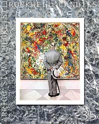 A1. PROCEED SLOWLY A1. PROCEED SLOWLYThe rush is a bad counselor. As I said above, almost daily I’m looking in 3D warehouse for new models in order to evalute them later. I try to examine a model as carefully as possible, in relation to its complexity. I'm looking for models that interest me, that say me something... I express a mental opinion and put them by the bookmarks I called VOTE! and then periodically (about three of four times a month) I revisit them and eventually evalutate with stars and formal review. | 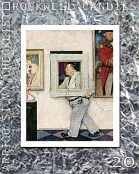 A2. EVALUATE THE MODEL A2. EVALUATE THE MODELInitially, I focus only on the model and its features, trying not to think about modeler (in some cases well know) that produced it, or about other similar models, or what alternatives could have been implemented to solve some parts of model. I try to make me first a dispassionate assessment - and it’s not so easy... | ||
 A3. FIRST THE ARCHITECTURE A3. FIRST THE ARCHITECTUREThe geometry is the first basic element of a 3D model, and should examine carefully loading the model in SketchUp and removing the colors with View> Faces Style> Monochrome or using Xray Mode. I verify that the architecture is well defined, error-free or without more or less noticeable imperfections such as mirror or radial asymmetries - except, of course, very special cases, where these exceptions are required by fidelity to the original! |  A4. SECOND THE TEXTURES A4. SECOND THE TEXTURESThe colors and textures are the second basic element, and must be examined carefully at different distances, from near and far, and even resorting to the panel of Materials. When I see textures very well done I always wonder how I could get to like... in some cases I export on my PC some textures to better examine them, and hoping to steal some useful secre! | ||
 A5. THIRD THE DETAILS A5. THIRD THE DETAILSAlthough it is often delicious zooming in on a 3D model to distinguish more and more detail, I consider the details, especially architectural, a double-edged sword. It is not always true that “more details make the model more beautiful and expressive”. In some cases too many details can be confusing and make the structure less readable, or excessively cumbersome the model. An important… detail: the details must be significant! |  A6. FOURTH THE ACCURACY A6. FOURTH THE ACCURACYAccuracy, precision and continuity. Accuracy in arrangement and the juxtaposition of textures, such as the eaves on the corners of buildings that must be consistent, at the same height; the windows must not be truncated at the half, the patterns must not be broken… Precision in detail definition, as the capitals of the columns, cornices or projections of the roof, terrain interface with Google Earth… Continuity, ie constancy and consistency in the implementation of objects or similar parts, eg chimneys, cupolas, steps… | ||
| A7..A13 - Beware... | |||
 A7. BEWARE THE SLOVENLINESS! A7. BEWARE THE SLOVENLINESS!Making models for me is a technical and aesthetic activity at the same time: a model is a bit as a painting, that should be done with love. Sometimes I examine models that seem pulled down, made not only hastily but sloppy with errors and howlers due not so to incompetence in modeling tecnique but - say – to the lack of love ... It would be better to make a few models - but good ... |  A8. BEWARE THE LAZINESS A8. BEWARE THE LAZINESSI try to look into the models, even when they were created by well-known and talented modelers. But sometimes “…quandoque bonus dormitat Homerus…” - even the great Homer dozes… - and so does not match some model - and then I do not feel compelled to give it my vote! | ||
 A9. BEWARE THE DISTORSIONS A9. BEWARE THE DISTORSIONSThere are various types of distortions: in the proportions of the entire composition, in some parts of the architecture, in some detail (typically statues, ornaments), in textures (mainly due to perspective deformations). It is true that perfection doesn’t exist…, and we often have to deal with the difficulty of finding of good photos, but in some cases, excessive deformations compromise the model quality. |  A10. BEWARE THE WRONG TEXTURES A10. BEWARE THE WRONG TEXTURESI define five categories of wrong textures: TOO DIRTY 1. too low quality: too light, too dark, not decipherable … 2. spilled: contaminated by foreign materials (road signs, cars, trees) that are not according to the resto of the model 3. distorted: too distorted by the perspective that create too much ambiguity and confusion TOO POLISHED 4. standard: too perfect since standardized 5. not seamless: creating repetitive, irrelevant and annoying patterns | ||
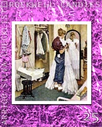 A11. BEWARE THE FAÇADE SYNDROME! A11. BEWARE THE FAÇADE SYNDROME!Some 3D models have what I define the Façade Syndrome of Hollywood Syndrome: a beautiful façade, painted with a single texture of perhaps flashy high quality ... but everything stops there. If the building has only one visible face, I'm glad to see it made one beautiful textures trompe l'oeil ... (instead of the model I can look at a beautiful photograph ...) but I hope to find interesting architectural reliefs. If, however, has other interesting side, I expect that - in addition to the findings of the main facade - the other sides are carried out in a credible and decent and not filled with simple color or texture is not seamless and standardized riptetive. Unfortunately some models stop only at the façade! |  A12. BEWARE THE UNNECESSARY WEIGHT! A12. BEWARE THE UNNECESSARY WEIGHT!In my opinion a good model should have a weight consistent with its features, with the complexity of its architecture and the quality of its textures – I consider each overweight an annoying construction defect, which although doesn't compromise the aesthetic aspect anyway restricts the manageability of the model with unneccessary weight and complexity. To reduce weight without sacrificing texture quality tyou can real my article Optimizing Textures in the Tutorial Section of this Blog. | ||
 A13. NOT UNIQUELY IN GOOGLE EARTH! A13. NOT UNIQUELY IN GOOGLE EARTH!The modelers can include models in 3D warehouse without making available the *.skp files - this makes more difficult (or impossible) to load it in SketchUp for a full examination. I do not like these models because I’m forced to examine them - only partially - in Google Earth. But I must admit that there are some such models very well made and that we must consider good! | |||
| A14..A20 - Reward... | |||
 A14. REWARD THE GOOD STRUCTURE! A14. REWARD THE GOOD STRUCTURE!A good, strong structure is a desirable feature for a 3D model. A solid approach, understood both in terms of architecture (as articulation of the various parts of a building: body, coverings, domes, etc.), that in terms of textures (as coherence amongst themself and consistency between textures and the various parts of the architecture) gives the model a pleasant and reassuring professional appearance. |  A15. REWARD THE TRANSPARENCY! A15. REWARD THE TRANSPARENCY!I am inclined to like models that can be easily inspected and that are well documented. I appreciate for example that the model provides a URL for documentation (historic infos, plants, photos) very useful especially when the building is not universally know. I also give much value to a technical well designed and robust approach, such as layers presence, well structured and named groups and components, well named textures… | ||
 A16. REWARD THE GOOD TEXTURES! A16. REWARD THE GOOD TEXTURES!A good texture must be clear, clean, saturated in the right level, without disturbing elements, consistent with other textures of the model, properly sized in terms of kbytes ... It seems easy to obtain and apply good textures, but it is perhaps one of the hardest things. I admire and reward models with excellent textures! |  A17. REWARD THE PLAINNESS! A17. REWARD THE PLAINNESS!A model should be a good model without necessarily being complicated. Each model should be as simple as possible consistently with the structure and the characteristics of the represented object. There are models that appear simple and spontaneous, even when the represented buildings are complex and elaborated... To discover this secret we must see them up close and groped to understand the secret of their apparent simplicity! | ||
 A18. REWARD THE IMAGINATION! A18. REWARD THE IMAGINATION!Sometimes I come across in a model adopting the solutions that I've never seen before: then I try to understand how the modeler has achieved this good result, and I also try to think in such cases I could implement the same solutions - anyway I try to make it a treasure for the future... It is worth rewarding that model and writing a positive review! | 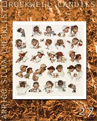 A19. REWARD THE SCENES! A19. REWARD THE SCENES!There are some interesting features of SketchUp that can be very useful for the model visitors: one is the Scenes mode that allows us to see the model from different points of view with a simple click, or enjoying a real-time animation... This function is almost indispensable - and most acceptable - when the model is very articulated and detailed even in indoor environments. | ||
 A20. REWARD THE “MADE WITH LOVE”! A20. REWARD THE “MADE WITH LOVE”!It's difficult to grasp the peculiarity of the made with love models... but when we look at one of these models, perhaps not perfect from a technical standpoint, there is spontaneous the thought “This model must have been much loved by its author” which is having worked a long time, trying to put a part of himself into those building, those church particularly dear to him… | |||
| A21..A23 - Towards perfection... | |||
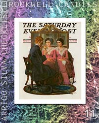
 A21. PERFECTLY IN TUNE! (HARMONY) A21. PERFECTLY IN TUNE! (HARMONY)When everyone in a choir sings his part perfectly in tune and all the parts are perfectly synergic, then the listener is enchanted and captivated from those wonderful harmony… The same thing happens in a model when architecture blends with colors and textures, when the viewer is still admired by the whole model but also by all its details… | 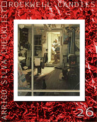 A22. GENIUS LOCI… A22. GENIUS LOCI…Another small miracle happens when the model is not only perfectly in tune inside but also give us the precise idea and atmosphere of a particular place represented, causing the same sensation we felt if we were really in those place. Look carefully at the masterpiece of this Sweet: What better than this painting can recreate the environment of the room and the mysterious back room of the barbershop ... don’t we believe to hear the sounds of the instruments, to warn the heat of the stove? Rockwell has captured the Genius Loci! | ||
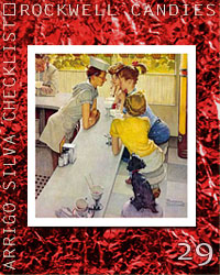 A23. MORE THEN A 3D PHOTO… A23. MORE THEN A 3D PHOTO…This tender painting of this Sweet confirm me that the great painting of Rockwell can tell us a lot more than a photograph - and likewise I believe that a great 3D model can express much more than a photographic 3D model. I appreciate, especially from a technical standpoint, the perfect 3D reconstructions of monuments presented also in 3D warehouse, and I admire the models rich in architectural details very precisely and realistically reconstructed, but here I must express my instinctive preference toward the models perhaps a bit more streamlined but more fresh and spontaneous, wich can better captur - at least for the performances in SketchUp and Google Earth - the Genius Loci! | |||
Section B - SOCIAL ASPECTS (Aspect IV)

I am well aware that My Personal Checklist is really… personal, ie subjective, and probably will not be shared by all players - but I hope that my reflections together with the beautiful pictures of Rockwell have been stimulant and hopefully or at least... Sweet!
| if you agree - or even if you don't agree with my vision, please use the COMMENT area to make remarks or comments and to share your personal approach! |
Labels: -My_Personal_Checklist
Comments:
<< Home
The reading of this checklist made me cheeks blush. First of all, it made me angry......towards my self. Secondly, it forced me to discover my own ignorance. I declare this the 35 commandments of the Sketchup modeller.
Regards.
St. Pall
Regards.
St. Pall
Hi Enrico! I'm very agree with most of the items, specially the social aspects. I assume I'm a generous evaluator. Actually I prefer don't give any type of rating than give a bad one.
By the way, both your blog design and your 3d models are awesome.
Greetings,
alsomar.
By the way, both your blog design and your 3d models are awesome.
Greetings,
alsomar.
<< Home







Post a Comment