Sunday, October 31, 2010
Notes about the model "St Peter's Basilica and Bernini's Colonnade"
Here are some notes on the design of my 3D SketchUp model, published for the first time on Oct 12, 2010 and that you can see in 3D warehouse
In these notes I would like to focus mainly the structural aspects, showing which are the main blocks that have guided me in structuring the model, while providing some pictures that I looked interesting and meaningful.
Identify the structure was relatively easy: as most of the Renaissance basilicas, St. Peter's was designed according to clear and rigorous geometric constructive principles - even if the entire composition is particularly articulated and complex, and totally original as demonstrated by the brilliant Bernini's Colonnade.
The dominant feature is the bilateral symmetry, both in the Basilica and in Square and Colonnade - but great importance is also the circular form, with the Dome and the two branches of the Colonnade.
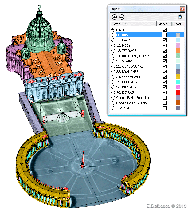
The image presented here shows how the various parties have been named, through the use of SketchUp layers, which allows us to gain greater control at design time on the various aspects of the model, characterizing the portions of the model and allowing us to control them separately without losing the sight of the whole.
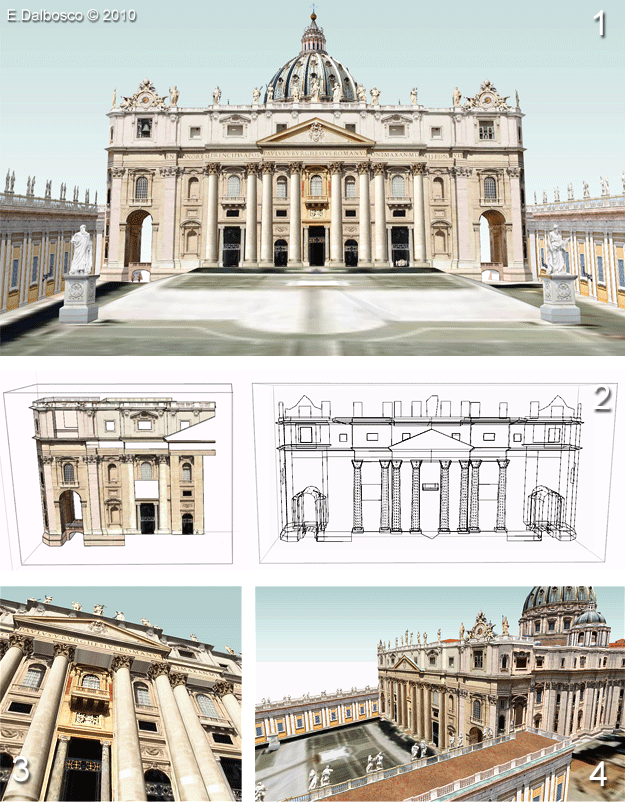
The solemn facade (1) designed by Maderno has a distinct bilateral symmetry and is divided into two horizontal bands, surmounted by the balustrade adorned with the glory of the great statues, and punctuated by the giant columns and pilasters that are flat at the sides and increasingly in relief to the center (3) characterized by the so-called "Balcony of Blessings" surmounted by the large tympanum.
In the model all elements are simmetrically built with few exceptions, such as the central elements, the statues and the great central writing "IN HONOREM PRINCIPIS APOST PAVLVS V BVRGHESIVS ROMANVS PONT MAX AN MDCXII PONT VII" (2).
The image (4) shows how the sides of the Facade are harmonically joined with the body of the Basilica.
The outline of the body is... a deception - that gives very hard time to a 3D modeler!
At first glance it seems pretty simple to make, but analyzing it better you get lost in a myriad of pilasters, cornices, windows, little windows, pediments and capitals...
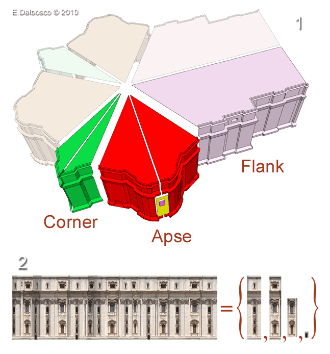
But we discover that there is much rhythm, almost like a music that accompanies a severe but very sumptuous religious ritual: the perfect bilateral symmetry of the Basilica (binary rhythm) is interwoven with the apses which are repeated - literally - three times (ternary rhythm); each apse, and each corner, in turn has a perfect bilateral symmetry... (1)
Furthermore, the whole outline is divided into horizontal bands separated by ledges that surround it for the whole extension (and that are common to the facade); capitals, windows, little windows, etc add extra pace and movement.
And we also discover that the constituent textures are relatively few (2) and that, following the rhythm, it is quite natural wrap them around the architectural elements...
I have already written an article on the design of the Colonnade, which you can read in My Models > Bernini's Colonnade
I always thought the Colonnade as an entity complementary to the Dome: the Dome, perfect in its roundness, stretches to the sky - perhaps channeling the prayers of the faithful up there... The Colonnade, as near-perfect in its roundness, extends towards the earth - accepting the faithful people so that they can pray...
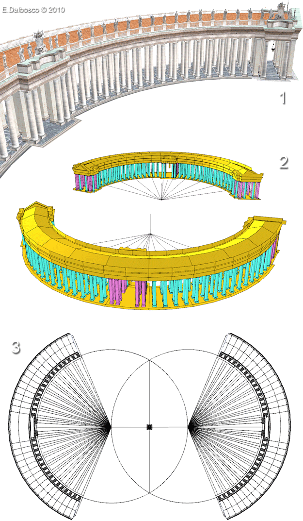
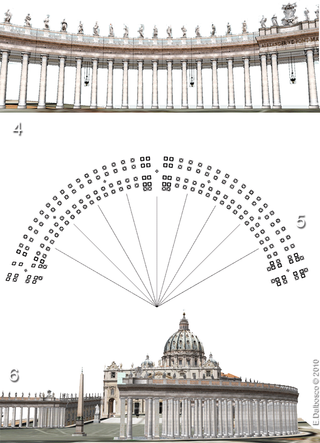
In (1) you can see a particular of the North-East branch, with two entrances, East and Central; between the two inputs runs - as celestial sentinels - a quadruple flight of Tuscanic columns.
The image (2) shows the displacement of the columns (in cyan) and pillars (in purple) that alternate in accordance with aesthetic and constructive principles. The entire Colonnade, perfectly symmetrical on East-West axis, is constructed around two wonderfully twisted circles... (3)
Crossing the square of the Colonnade, the viewer feels surrounded - and protected - from the number of columns and pillars (almost four hundred), but there are two... magic points, the centers of two circles, from which the viewer see that the multitude of the columns magically shrinks and thins reducing to a sparse transparent row! (4)
The arrangement of columns in my model aims to reproduce as closely as possible the location of columns, so you can enjoy the magical alignment. (5)
The great Dome, the great Facade, the embrace of the great Colonnade: three unique and inseparable elements! (6)
You can find more design information in the article you can read in My Models > Bernini's Colonnade
And finally the domes, and especially the Big Dome of Michelangelo, the symbol and the crowning of the great Basilica!
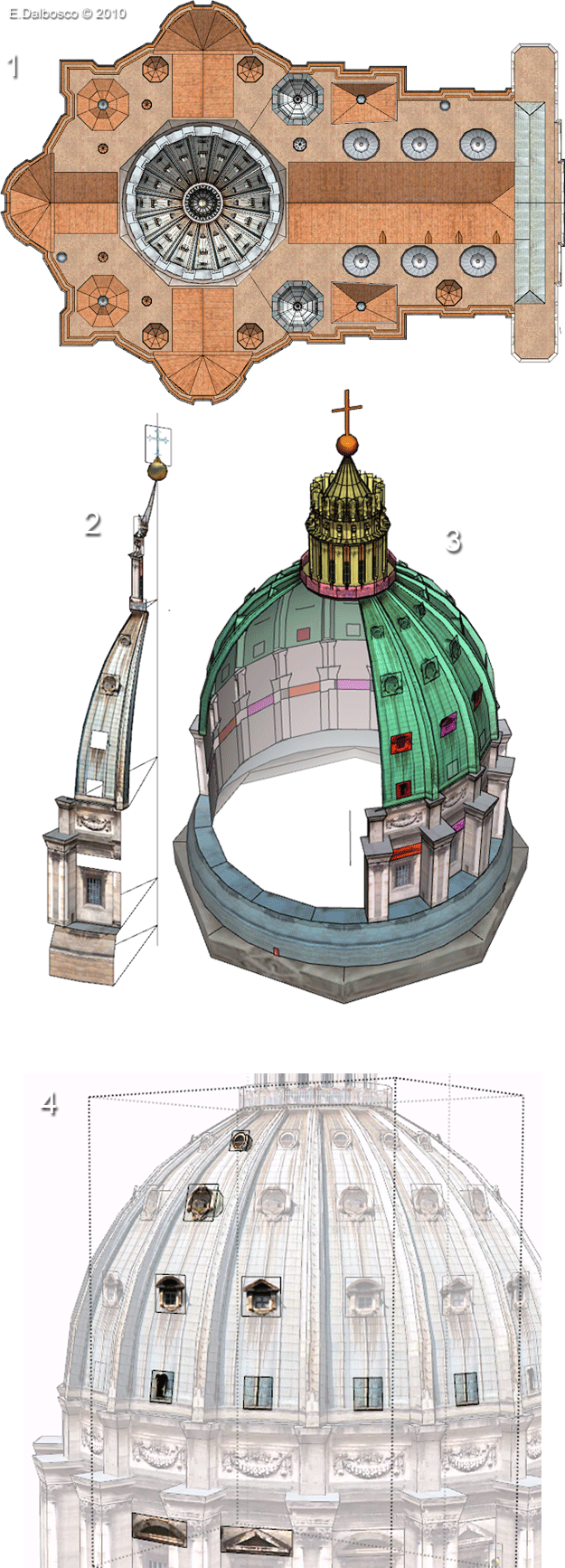
On the terrace, the pace of domes and cupolas follows the regular internal space of the basilica and culminates in the six lanterns, in the two large domes and the mighty dome of Michelangelo. (1)
The dome, which rests on an octagonal cushion, has a perfect radial symmetry. The generating segment (2) includes the drum, the actual concavity, the terrace and the lantern; the entire dome is obtained by rotating 16 times the generating segment. (3)
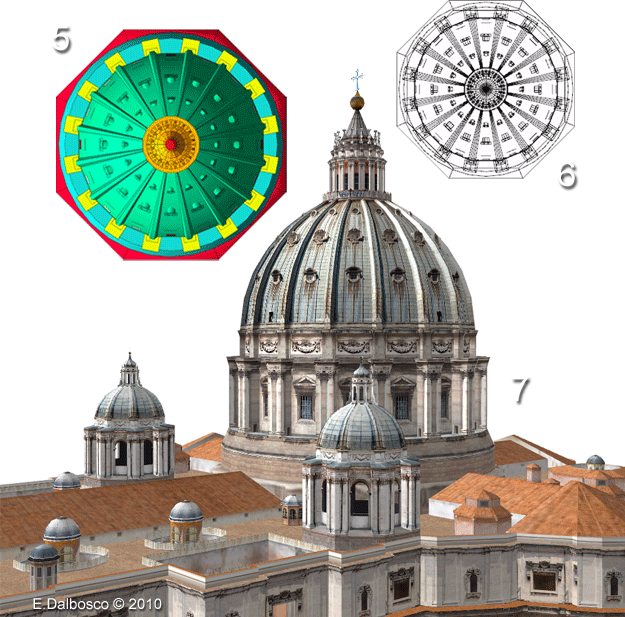
The figure (4) shows the small differences (the form or presence of some windows and doors) in the various segments within each quarter-dom.
The almost abstract beauty of the dome is even more evident from these two images taken from sky in false color (5) and wireframe (6).
Finally, in (7), a helicopter view of the domes seen from the north-east.
.
In these notes I would like to focus mainly the structural aspects, showing which are the main blocks that have guided me in structuring the model, while providing some pictures that I looked interesting and meaningful.
The Structure
Identify the structure was relatively easy: as most of the Renaissance basilicas, St. Peter's was designed according to clear and rigorous geometric constructive principles - even if the entire composition is particularly articulated and complex, and totally original as demonstrated by the brilliant Bernini's Colonnade.
The dominant feature is the bilateral symmetry, both in the Basilica and in Square and Colonnade - but great importance is also the circular form, with the Dome and the two branches of the Colonnade.
The image presented here shows how the various parties have been named, through the use of SketchUp layers, which allows us to gain greater control at design time on the various aspects of the model, characterizing the portions of the model and allowing us to control them separately without losing the sight of the whole.

.
.
===
The Facade
The solemn facade (1) designed by Maderno has a distinct bilateral symmetry and is divided into two horizontal bands, surmounted by the balustrade adorned with the glory of the great statues, and punctuated by the giant columns and pilasters that are flat at the sides and increasingly in relief to the center (3) characterized by the so-called "Balcony of Blessings" surmounted by the large tympanum.
In the model all elements are simmetrically built with few exceptions, such as the central elements, the statues and the great central writing "IN HONOREM PRINCIPIS APOST PAVLVS V BVRGHESIVS ROMANVS PONT MAX AN MDCXII PONT VII" (2).
The image (4) shows how the sides of the Facade are harmonically joined with the body of the Basilica.

.
.
===
The Body
The outline of the body is... a deception - that gives very hard time to a 3D modeler!
At first glance it seems pretty simple to make, but analyzing it better you get lost in a myriad of pilasters, cornices, windows, little windows, pediments and capitals...
But we discover that there is much rhythm, almost like a music that accompanies a severe but very sumptuous religious ritual: the perfect bilateral symmetry of the Basilica (binary rhythm) is interwoven with the apses which are repeated - literally - three times (ternary rhythm); each apse, and each corner, in turn has a perfect bilateral symmetry... (1)
Furthermore, the whole outline is divided into horizontal bands separated by ledges that surround it for the whole extension (and that are common to the facade); capitals, windows, little windows, etc add extra pace and movement.
And we also discover that the constituent textures are relatively few (2) and that, following the rhythm, it is quite natural wrap them around the architectural elements...

.
.
===
The Colonnade
I have already written an article on the design of the Colonnade, which you can read in My Models > Bernini's Colonnade
I always thought the Colonnade as an entity complementary to the Dome: the Dome, perfect in its roundness, stretches to the sky - perhaps channeling the prayers of the faithful up there... The Colonnade, as near-perfect in its roundness, extends towards the earth - accepting the faithful people so that they can pray...
In (1) you can see a particular of the North-East branch, with two entrances, East and Central; between the two inputs runs - as celestial sentinels - a quadruple flight of Tuscanic columns.
The image (2) shows the displacement of the columns (in cyan) and pillars (in purple) that alternate in accordance with aesthetic and constructive principles. The entire Colonnade, perfectly symmetrical on East-West axis, is constructed around two wonderfully twisted circles... (3)
Crossing the square of the Colonnade, the viewer feels surrounded - and protected - from the number of columns and pillars (almost four hundred), but there are two... magic points, the centers of two circles, from which the viewer see that the multitude of the columns magically shrinks and thins reducing to a sparse transparent row! (4)
The arrangement of columns in my model aims to reproduce as closely as possible the location of columns, so you can enjoy the magical alignment. (5)
The great Dome, the great Facade, the embrace of the great Colonnade: three unique and inseparable elements! (6)
You can find more design information in the article you can read in My Models > Bernini's Colonnade


.
.
===
The Domes
And finally the domes, and especially the Big Dome of Michelangelo, the symbol and the crowning of the great Basilica!
On the terrace, the pace of domes and cupolas follows the regular internal space of the basilica and culminates in the six lanterns, in the two large domes and the mighty dome of Michelangelo. (1)
The dome, which rests on an octagonal cushion, has a perfect radial symmetry. The generating segment (2) includes the drum, the actual concavity, the terrace and the lantern; the entire dome is obtained by rotating 16 times the generating segment. (3)
The figure (4) shows the small differences (the form or presence of some windows and doors) in the various segments within each quarter-dom.
The almost abstract beauty of the dome is even more evident from these two images taken from sky in false color (5) and wireframe (6).
Finally, in (7), a helicopter view of the domes seen from the north-east.


.
.
.
Labels: .CHURCHES, Saint_Peter
Comments:
<< Home
Questo modello è un capolavoro, non solo per come appare da completato ma anche per l'attento studio che ne ha permesso la modellazione. Complimenti!
Enrico complimenti! Un lavoro curato nei minimi particolari, splendido e brillante... avessi il file del modello ci girerei attorno per giorni. Credo di poter imparare molto da questo modello, attendo con ansia la pubblicazione.
Non vedo l'ora che questo modello sia pubblicato: credevo che dopo S. Maria del Fiore di Firenze non si potesse fare meglio, ma mi sono dovuto piacevolmente ricredere. Pazzesco, un modello così deve aver richiesto moltissimo tempo per essere realizzato ed è così bello che si potrebbe osservare per ore intere. Credo che cambierà radicalmente il volto di Roma in Google Earth: decine di migliaia di persone vedranno la cupola di Michelangelo stagliarsi contro il cielo della città eterna sui loro pc.
<< Home


Post a Comment